| Image |
Comment |
| 03/08/2006 05:43:06 AM |
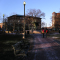
A Homecoming at Kennedy Plaza, Providence, RIby melismaticaComment by e301: I don't think this image works well in a square crop - it seems to me to cry out for a portrait framing, so that the seat and lampost balance the two figures; so you've made it fit the challenge by forcing a sqaure crop on an image, rathr than finding an image that works in square. There are strong elements here - the mottled light and the textures of the seat could be interesting, but to my eye it isn't effective in the required format. |
 Photographer found comment helpful. Photographer found comment helpful. |
| 03/08/2006 02:11:25 AM |
Everydayby melismaticaComment by melismatica: Originally posted by emmylou:
Doh! This should be in the top ten!
Well... its in MY top ten! |
Thanks a bunch. I'm actually pleased it did as well as it did considering it has so much that the average DPC voter seems to hate (centered subject, blown-out light, b&W). I thought it was funny for the challenge but I also like the image on it's own merit. |
| 03/08/2006 12:32:46 AM |
|
| Photographer found comment helpful. |
| 03/07/2006 03:45:08 PM |
|
| Photographer found comment helpful. |
| 03/07/2006 01:27:04 PM |
|
| Photographer found comment helpful. |
| 03/07/2006 01:57:08 AM |
Why Can't I Be You?by melismaticaComment by jmsetzler: Greetings from the Critique Club...
This photo didn't score very well for several reasons. First of all, I am not completely sure the subject and technique lend themselves well to the duotone theme. The toning choices you chose don't seem to add to the subject or the mood of the photo. The second issue is that it's a character portrait that very few people will find a connection with. Any photo of a person posted for public consumption needs some element of universal understanding, either in the subject itself or in the presentation of that subject. The high contrast portion of your composition is nice, but I don't care much for the motion blur from the long exposure. I will say that the motion blur may be adding an extra sense of tension in the image, but it's just not my favorite way to present things. |
| 03/06/2006 06:08:56 PM |
Everydayby melismaticaComment by alfresco: Initial response: positive
I like this photo, simple, effective, interesting. It lacks something and I just can't see what that something may be ... I'm going with 8 to start. Yes, 8 - final answer for now. I'll have to visit later. |
| Photographer found comment helpful. |
| 03/06/2006 12:37:29 PM |
Everydayby melismaticaComment by Phospective: Im not such a big fan of black and white photos, but this could only work this way. A nice touch with the chipped paint on the window sill |
| Photographer found comment helpful. |
| 03/04/2006 01:04:01 PM |
|
| Photographer found comment helpful. |
| 03/04/2006 11:09:08 AM |
|
| Photographer found comment helpful. |
Home -
Challenges -
Community -
League -
Photos -
Cameras -
Lenses -
Learn -
Help -
Terms of Use -
Privacy -
Top ^
DPChallenge, and website content and design, Copyright © 2001-2026 Challenging Technologies, LLC.
All digital photo copyrights belong to the photographers and may not be used without permission.
Current Server Time: 07/16/2026 01:47:19 AM EDT.