| Image |
Comment |
| 11/29/2003 12:48:02 AM |
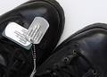
Our Troopsby BigMoComment by justine: Count me in too. I think their great, greater then great! Neat shot. I hope this does well. |
 Photographer found comment helpful. Photographer found comment helpful. |
| 11/29/2003 12:27:15 AM |
|
| Photographer found comment helpful. |
| 11/29/2003 12:17:54 AM |
|
| Photographer found comment helpful. |
| 11/28/2003 06:36:18 PM |
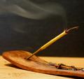
Aroma Therapyby BigMoComment by Azrifel: The strong items of this image are:
1) Great natural colors, yellowy wooden
2) Leading lines, a reversed Z, enter at the lower left, to the right, up to the left corner and out again with the smoke. The Zen of Aroma Therapy! :)
3) Nice shallow dof tries to emphasize the tip of the smoking thingy ("wierrook" in Dutch, don't have a dictionary at hand)
The only dislike is the background. I would like it better if it were fully black instead of noisy bluegrey/ antraciet.
Overall a good photo. 8 |
| Photographer found comment helpful. |
| 11/28/2003 02:48:48 AM |
Aroma Therapyby BigMoComment by ogdenm: Torn between trying to decide if the DOF limitation matter or not. I do like it and maybe am trying too hard to say something more. |
| Photographer found comment helpful. |
| 11/27/2003 09:17:37 PM |
|
| Photographer found comment helpful. |
| 11/27/2003 08:38:36 AM |
Aroma Therapyby BigMoComment by Kavey: Nice composition and viewpoint and use of smoke to add interest at top of frame.
Would allow just a small touch more of background at the right edge so that tip of holder isn't quite so close to edge of frame. Just a touch though.
Also curious as to how lower DOF would work - I think it could add further interest. |
| Photographer found comment helpful. |
| 11/17/2003 12:31:05 AM |
|
| Photographer found comment helpful. |
| 11/16/2003 07:35:49 AM |
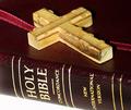
The Book of Christby BigMoComment by KevinRiggs: Perhaps a little too much exposure; the white at the bottom is overexposed. You might try a similar shot with a neutral colored background like a gray or muted tan/beige sheet underneath to provide more texture and less reflection of your light. The DOF is also shallow which works well with the cross trailing OOF but I don't like the effect it has on the ribbon. Perhaps what I really don't like is that the ribbon seems to be lifted. Is it flat against the Bible on the left side of the image? It appears to have a bend and that just "feels" wrong with all the lines and symmetry that is presented (between the gold verticals on the spine, the grains in the wood and the line of the ribbon on the right). |
| Photographer found comment helpful. |
| 11/15/2003 06:52:23 PM |
|
Home -
Challenges -
Community -
League -
Photos -
Cameras -
Lenses -
Learn -
Help -
Terms of Use -
Privacy -
Top ^
DPChallenge, and website content and design, Copyright © 2001-2026 Challenging Technologies, LLC.
All digital photo copyrights belong to the photographers and may not be used without permission.
Current Server Time: 07/16/2026 11:35:38 AM EDT.