| Image |
Comment |
| 05/06/2007 05:22:03 AM |
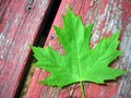
The Symmetry of Spring!by Kimber90Comment by 4trtone: I like the contrast of the green leaf against the weathered old wood. Parts of the wood look a bit out of focus and I don't think this adds to the photo. A bit more depth of field or a more parallel angle to the surface would bring clarity to the wood. |
| 05/05/2007 05:43:15 PM |
|
| 05/03/2007 09:23:58 PM |
|
| 05/02/2007 05:58:23 PM |
Simplicityby Kimber90Comment by colorcarnival: too bad for the DQ. was the background originally green? interesting contrast with the black, white and green. |
| 05/02/2007 10:57:55 AM |
|
| 04/25/2007 12:26:48 PM |
Simplicityby Kimber90Comment by Rino63: too on the norder the pot. It isn't on the line of the rule of tirds. there is a flare effect on the right on some white lines on the bottom that are distracting. |
| 04/24/2007 05:58:15 PM |
|
| 04/24/2007 11:12:33 AM |
|
| 04/23/2007 10:03:12 PM |
Frizz!by Kimber90Comment by gdub1189: wow this is frizzy! nice composition. i like how you're only showing half of the face. also, nice contrast and lighting. great job! |
| 04/23/2007 12:25:53 PM |
|
Home -
Challenges -
Community -
League -
Photos -
Cameras -
Lenses -
Learn -
Help -
Terms of Use -
Privacy -
Top ^
DPChallenge, and website content and design, Copyright © 2001-2026 Challenging Technologies, LLC.
All digital photo copyrights belong to the photographers and may not be used without permission.
Current Server Time: 07/15/2026 04:04:01 PM EDT.