| Image |
Comment |
| 01/04/2004 11:33:43 AM |
|
| 01/04/2004 02:05:28 AM |
Portrait Studyby jonpinkComment by wingy: I like this. The black hair with just the highlights showing through, and having it draped over her eye, which also only shows the highlights, all produces a nice effect. The smile is a bit awkward perhaps. I'm not really sure about the hint of red in the bottom right. I can't decide if it adds another point of interest or throws off the balance of the shot. Probably both, so I'm not sure whether that hurts it or helps it, but it's an issue to consider carefully: whether you want that to introduce a strong red without making it very important to the shot. |
| 01/03/2004 07:01:49 PM |
Portrait Studyby jonpinkComment by Azrifel: Your choice of lighting makes the face pop out really well. Nice pose and good composition, color seems to be good. The foto does seem a bit soft, but that could be intentional with a portrait.
Perhaps you could use some dim lights from the left to add a more interesting reflection in the eyes, but that's being nitpicky.
I like it. 8 |
| 01/03/2004 03:15:51 PM |
|
| 01/03/2004 03:41:57 AM |
|
| 01/02/2004 11:41:43 PM |
|
| 01/02/2004 05:20:22 PM |
Froggerby jonpinkComment by ronners: [Critique Club]
Funny enough, I saw this one yesterday, though haven't commented until now ;)
First and foremost, the most striking thing about this image is the use of light. The texture and sense of intimacy is wonderful. The black background helps tremendously to focus on the frog - irrespective of whether it's cooperating or not. The nearer (though not completely sharp) tree branch acts as a good lead-in as well.
On the technical side, the frog's head isn't quite sharp as a result of the shallow DOF. Choosing a focus point closer to the head would have worked a little better. It's also a shame that the lower branch isn't quite sharp - not because 'sharpness is everything' but because it's a little distracting. Since you were able to post-process this one, I'd suggest darkening that area a little so that it no longer draws so much attention.
Overall, great light, nice composition, and a nice portrait of a disinterested subject. |
| 01/02/2004 01:02:40 PM |
|
| 01/02/2004 11:47:13 AM |
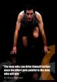
Drive yourself furher..by jonpinkComment by dr rick: Good pose and expression, and the low key approach works well with the poster's theme. I don't know that the runner is in pain yet, but the idea comes across anyway. The orange arrow adds a nice touch of color, but the way it crosses the model's hand and wrist is rather distracting. |
| 01/02/2004 05:45:22 AM |
Drive yourself furher..by jonpinkComment by birgir: This has be validated but I don't know how you can put his arrows there with out being illegal. But great photot, would be better without the reflection. -9 |
Home -
Challenges -
Community -
League -
Photos -
Cameras -
Lenses -
Learn -
Help -
Terms of Use -
Privacy -
Top ^
DPChallenge, and website content and design, Copyright © 2001-2026 Challenging Technologies, LLC.
All digital photo copyrights belong to the photographers and may not be used without permission.
Current Server Time: 06/20/2026 08:27:52 AM EDT.