| Image |
Comment |
| 02/18/2007 12:24:03 AM |
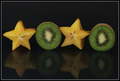
Hugs and Kissesby CapeSailComment by mobster: Nice, I like the reflections.
however I think that the lighting is a tad bit flat (at least it looks that way on my monitor) |
 Photographer found comment helpful. Photographer found comment helpful. |
| 02/17/2007 11:36:56 AM |
Hugs and Kissesby CapeSailComment by Simpa: XOXOXOXO to you to... great shot... great idea... just a bit dark I find... I have to say that lots of hugs and kisses are made in the dark ;-)))))) |
| Photographer found comment helpful. |
| 02/14/2007 06:41:42 PM |
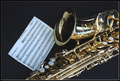
Saxophonicby CapeSailComment by bassbone: The lighting on the sax is good, but the choice of a small marching band piece of music really does not help - it probably would have done better without any music. |
| Photographer found comment helpful. |
| 02/14/2007 01:07:14 PM |
|
| Photographer found comment helpful. |
| 02/13/2007 11:04:20 AM |
Hugs and Kissesby CapeSailComment by JulieG: Nice. I like the sharpness and the idea. The colors are nice together. The hint of reflection is just right. It might be a tad dark or that may just be my monitor. Overall it's very good. |
| Photographer found comment helpful. |
| 02/12/2007 11:53:18 PM |
|
| Photographer found comment helpful. |
| 02/12/2007 07:47:21 PM |
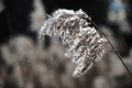
Winter's Foliageby CapeSailComment by kteach: Wow, you're really lacking on comments on this one! :P Well, I like this one. I love all the fuzzy little plants you can find in the winter. They're a nice diversion from sticks and branches. The shallow dof is great here.
So, since I like this one, here are a few ideas... just food for thought.
You probably shot this at the 135mm end of the lens, which is why you were at f/5.6, but if you could have gotten closer and shot more towards the 18mm end, you could have pulled the aperture down to f/3.5 giving you an even shallower dof and a more blurred background. Would have isolated the plant even more. As far as composition, it's still pretty centered (seems like that is the way you're comfortable shooting or cropping) but moving it slightly off to the side might help?
In processing, adjusting the levels of just the red and blue channels would have given the shot a warmer brownish hue, and maybe just adjusting the hue/saturation could have done the same. Also, a slight USM might have brought out the individual fuzzies a little more (sorry I don't have a more technical term for them!)
|
| Photographer found comment helpful. |
| 02/12/2007 07:23:34 PM |
|
| Photographer found comment helpful. |
| 02/12/2007 07:20:16 PM |
Old Moneyby CapeSailComment by kteach: Me again, back for more comments! :)
First off, I'm jealous.... I'm saving up for this lens! I've been completely amazed by the shots I've seen from it! If you want some examples of some great macro shots, click on the lens and check out ursula's portfolio... I think dax also has this lens, and she has some very nice work too with it.
I don't know what the setup was here, but it looks like you were aiming for a diffused light, which didn't leave a lot of harsh shadows and glare, which is good, but I think it's still a bit overexposed. Compositionally, I wish some of the pennies were turned over, maybe to see the dates? Also, I'm not sure what the background is, but you have little dimples of it showing through in the lower left corner.
I don't know how much of a crop this is out of the original, but it seems a bit soft. Were you using a tripod or was this hand held? You'll get much better results on a tripod, and also by using the self timer, or a remote to remove any chance of you jostling the camera while you push the button.
I did a few edits to boost the contrast and color, to sharpen it up, and to get rid of the distracting background in the corner, and listed the steps in the comments:
 Message edited by author 2007-02-12 19:22:05. Message edited by author 2007-02-12 19:22:05. |
| Photographer found comment helpful. |
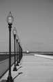
| 02/12/2007 06:58:04 PM |
Ft. Tabor Pier - Black & Whiteby CapeSailComment by kteach: This looks nice... you might have even been able to push the contrast even a bit more with the levels and adjustment layers. The nice thing about those layers is that you aren't damaging any of the info in the photo... you can always just delete the layer, or adjust how much of it is there. I try to push it as far as I can, and then back off until the details in the black/white areas are back. Just my personal preference though for the way I process photos. |
| Photographer found comment helpful. |
Home -
Challenges -
Community -
League -
Photos -
Cameras -
Lenses -
Learn -
Help -
Terms of Use -
Privacy -
Top ^
DPChallenge, and website content and design, Copyright © 2001-2026 Challenging Technologies, LLC.
All digital photo copyrights belong to the photographers and may not be used without permission.
Current Server Time: 07/16/2026 11:35:43 PM EDT.