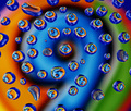
DPChallenge: A Digital Photography Contest You are not logged in. (log in or register
 
Browse Settings
Currently viewing:
Registered UserPatsfan

Show comments:

Per page:

Order:

Comments:


Comments Received by Patsfan
Pages:   ... ... [51]
Showing 71 - 80 of ~503
Image Comment
Day 10
08/30/2008 12:26:14 PM
Day 10
by Patsfan

Comment by Mr_Pants:
I like the fact that you even went to the lengths of plugging it in, too.
Photographer found comment helpful.
Day 9
08/30/2008 12:25:16 PM
Day 9
by Patsfan

Comment by Mr_Pants:
I rather like the fact that the ball is not immediately obvious.
Photographer found comment helpful.
Day 8
08/30/2008 12:24:33 PM
Day 8
by Patsfan

Comment by Mr_Pants:
So you found a use for the knife, then?
Photographer found comment helpful.
Day 7
08/30/2008 12:23:47 PM
Day 7
by Patsfan

Comment by Mr_Pants:
Nice balancing trick.

I like it.
Photographer found comment helpful.
Day 6
08/30/2008 12:22:47 PM
Day 6
by Patsfan

Comment by Mr_Pants:
I think that I'd like to see a little more light on the face in this one.
Photographer found comment helpful.
Day 5
08/30/2008 12:22:10 PM
Day 5
by Patsfan

Comment by Mr_Pants:
That's a very determined look there.
Photographer found comment helpful.
Day 3
08/30/2008 12:21:23 PM
Day 3
by Patsfan

Comment by Mr_Pants:
Great smile here.
Photographer found comment helpful.
Day 2
08/30/2008 12:20:43 PM
Day 2
by Patsfan

Comment by Mr_Pants:
How close were you to dropping the camera in the water?
Photographer found comment helpful.
American Cream
08/28/2008 08:32:30 PM
American Cream
by Patsfan

Comment by dafletchr:
The softness works nicely.
Photographer found comment helpful.
9 + 6 + 6 + 6...
08/28/2008 03:55:16 PM
9 + 6 + 6 + 6...
by Patsfan

Comment by ambaker:
Critique Club Review:

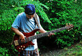
Color Saturation and Hue: All are well done, colors are vibrant without being over saturated. Hues are pleasing to the eye.

Brightness and contrast: Brightness is at the right level for this type of image. Contrast is well done, nothing is overly bright or too dark.

Focus and depth of field: Focus is nice and sharp. Depth of field kept deep enough to keep the background soft and prevent overpowering the foreground, and sharp enough to be recognizeable.

This image reminds me of an old John Setzler photo. As already noted, the drops could have been done better. The misshapen and small drops distract from the well formed drops that form the sixes. Use of an eye dropper or pipette could help get you uniform drop sizes. A pattern, whether it be a sprial, or other shape might work well as opposed to the randomness here. A spiral in the same direction as the number 9 might look really good.

As is, a creative image, with some great colors and visual interest. I could see this hanging in a gallery or an office some place.

Nice work. Congratulations on your top 20 finish.
Photographer found comment helpful.
Pages:   ... ... [51]
Showing 71 - 80 of ~503


Home - Challenges - Community - League - Photos - Cameras - Lenses - Learn - Help - Terms of Use - Privacy - Top ^
DPChallenge, and website content and design, Copyright © 2001-2025 Challenging Technologies, LLC.
All digital photo copyrights belong to the photographers and may not be used without permission.
Current Server Time: 07/30/2025 11:18:04 PM EDT.