| Image |
Comment |
| 07/18/2015 12:44:44 PM |
The Subwayby romilComment by sidpixel: *Hello from Sid and the Critique Club*
First impressions are of a lovely lady who jumps out from the brightly lit surroundings to meet the challenge well.
Its very brave of you to choose to photograph your wife in such a situation especially with minimal editing rules applied, as you say, kudos to your wife but to you also, well done. You're a very lucky man, she's lovely and has a natural pleasing smile. From the position you have chosen she is fairly uniformly illuminated so no glaring problems with shadows and highlights, though it might have been nicer if her eyes were a little better lit.
In terms of the very soft background, I don't know if it would have been possible to eliminate them but the thing that bothers me most are the two bright lights above her head, followed closely by the bright patch to her right and the general overexposure. It would also have improved it if your timing had been such that the person, again to her right, could have been hidden. He is the main distraction but the 'midget' on her left shoulder doesn't help either. You could probably have used a lower ISO but I don't see any noise issues here anyway so its a throwaway observation really.
Whilst it is a good attempt and I feel it deserves a better score, some of the issues I have mentioned may help explain why it didn't but thanks for submitting and good luck with your future entries, Sid |
| 07/17/2015 03:28:17 PM |
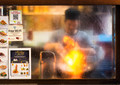
The Cook.by romilComment by cowboy221977: Hello from the critique club....
I will start out by saying that I do like your shot. It appears that others agree with me based on your score. However I am torn with the stickers on the glass on the left. Part of me sais the need to go....Then another part of me sais no they add interest too the shot. I do think they add interest but I don't like the fact that they are cut off on the left. Good job. Happy shooting. |
 Photographer found comment helpful. Photographer found comment helpful. |
| 07/16/2015 04:26:39 PM |
The Cook.by romilComment by streetpigeon: A warm, interesting image, subtly softened through the glass. In my humble opinion, the signage is a distraction. |
| Photographer found comment helpful. |
| 07/15/2015 04:51:14 PM |
|
| Photographer found comment helpful. |
| 07/15/2015 02:25:41 PM |
The Cook.by romilComment by chalice: One of my choices to ribbon. Nails the challenge topic. I also like the composition, with the labels on the left. |
| Photographer found comment helpful. |
| 07/15/2015 12:54:39 PM |
|
| Photographer found comment helpful. |
| 07/08/2015 08:21:09 PM |
The Salesman.by romilComment by romil: Originally posted by sidpixel:
*Hello from the Critique Club*
The only minor criticism of the children is that the action he is making with the scissors being so close to the back of the child's head make it look as though he is cutting her hair.
|
Haha! Thank you for that precise observation. I never saw that and now I cannot unsee it! :)
Thanks for your critique. Good to know that there wasn't a lot of wrongs with the image. Perhaps street photography is a bit tough to outscore the landscape long exposures that crowd the free studies. |
| 07/08/2015 12:43:18 PM |
Grace.by romilComment by sidpixel: *Hello from the Critique Club*
What a lovely portrait, it has instant impact.
The very shallow DOF and accurate focus on the near eye against the dark background all work very well together, nicely broken up by the splash of colour from the scarf. With regard to the scarf I personally would have liked it to be a little lower enabling me to see her mouth too, I think it could have made a stunning portrait into a sensuously appealing one too, though you could and probably would argue that hiding her mouth adds a sense of mystery.
Technically the lighting is gentle with no harsh shadows though the scarf is darkening her face in an ever so slightly moustache-like way indicating that the lighting is from below. Its a good exposure, there is good detail in both shadow and highlight areas.
In respect of the challenge her eye is nicely placed on the right vertical, you might have considered placing it a little higher on the hotspot which may have improved it overall but that would have involved some cropping to her forehead.
I hope Grace was well pleased with your image, I and the voters were! |
| Photographer found comment helpful. |
| 07/08/2015 12:24:50 PM |
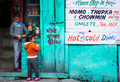
The Salesman.by romilComment by sidpixel: *Hello from the Critique Club*
The first thing that hits me with this image is the coloured wall, followed by the menu then the children.
A great slice of everyday life in a downtown suburb of the East, in this case India, if it weren't for the lovely local script this could be anywhere except that Momo etc are not readily available in my local vicinity!
I like the candid nature of the shot the children appear to be unaware of the camera and therefore naturally involved in their own moment. The colours are all very strong, I also like the way the colours from the writing are repeated in the children's clothes. I love the child's too big pink shoes!
I don't know if you've enhanced the children's faces but they stand out from their surroundings in a natural appealing sort of way. The only minor criticism of the children is that the action he is making with the scissors being so close to the back of the child's head make it look as though he is cutting her hair.
Altogether an appealing and natural moment in time well captured, reflected in the votes it received.
|
| Photographer found comment helpful. |
| 07/08/2015 12:13:28 AM |
Grace.by romilComment by sfalice: Oh, I'm so pleased this finished well in this Challenge.
lovely image. |
| Photographer found comment helpful. |
Home -
Challenges -
Community -
League -
Photos -
Cameras -
Lenses -
Learn -
Help -
Terms of Use -
Privacy -
Top ^
DPChallenge, and website content and design, Copyright © 2001-2026 Challenging Technologies, LLC.
All digital photo copyrights belong to the photographers and may not be used without permission.
Current Server Time: 09/28/2026 10:41:42 AM EDT.