| Image |
Comment |
| 07/26/2015 11:55:34 PM |
|
 Photographer found comment helpful. Photographer found comment helpful. |
| 07/26/2015 11:19:25 PM |
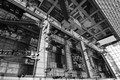
Escher's Cityby romilComment by bohemka: The lines, the light, the shadows, the depth. It really is three-dimensional. Very nicely framed, particularly at its base. Well seen and well taken. |
| Photographer found comment helpful. |
| 07/26/2015 11:06:35 PM |
|
| Photographer found comment helpful. |
| 07/26/2015 06:30:35 PM |
Escher's Cityby romilComment by quiche: An excellent composition and great title. Good tonal range too. Very interesting. |
| Photographer found comment helpful. |
| 07/25/2015 05:16:47 AM |
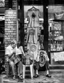
The Competition by romilComment by sidpixel: *Hello from Sid and the Critique Club*
Congratulations on your well deserved ribbon for an excellent image that meets the challenge very well.
What a pleasure it is to be given this wonderful image, I'm sure as soon as you saw this on your monitor you thought, YES! I'm gonna love this image anyway because I love mono and I love the inclusion of people to add interest so this ticks all my boxes straight away. The execution is perfect, the exposure and the timing are both spot on.
You have a lot of enthusiastic comments and a detailed one from 'SwordandScales', whom I largely agree with he has said all the things that I feel about the image myself. Obviously, as he has not elaborated on the technical aspects, I don't know but I imagine he may be talking about having a deeper DOF to perhaps see those behind a little more clearly, particularly the man with his clenched fist to his mouth. I can see there is an argument for that but I think I prefer it just the way it is, the emphasis is well and truly on the player deep in thought about his next move. Perhaps it may be the tiny hotspots of overexposure on the faces of some of them, particularly the clenched fist character, and the background but it is so minor and preferable to what would have been a tendency towards underexposure.
I love your composition with the board and protagonists in the region of the lower right hotspot giving the rest of the frame to the onlookers who are all equally immersed in the play. You feel that this is the highlight of their day, it feels the very reason for their existence such is the intensity of it all, brilliant.
A superb study that you have every right to be proud of, well done, Sid |
| Photographer found comment helpful. |
| 07/21/2015 01:03:57 PM |
|
| Photographer found comment helpful. |
| 07/21/2015 08:33:20 AM |
Expert Adviceby romilComment by sidpixel: *Hello from Sid and the Critique Club*
An interesting image with lots to get absorbed in.
The focal point for me is the character sitting on the floor, he looks such a happy chappy with his single tooth! I rather wish his attention was drawn to his mate rather than the camera itself though. The window tells us more about them and their locality and trade and in itself has lots of interesting stuff to add to the story.
You have a lovely full range of tones throughout which good old SFX has brought out the best of together with the detail. It appears to be fairly low light given your settings and the light from the bulb. It feels a bit of a grab shot that is making the most of the natural moment as opposed to anything planned.
I need to mention a few minor issues that may, or may not, help to improve the end result. I have a bit of a problem with the left hand edge and wish it wasn't there so that the edge of the frame was the brickwork itself, now you may well argue that would position the other man too close to the edge which would be fair comment. I think it might be worth having a quick look at that crop removing the top edge where two more problems can be eliminated ie., the two light sources at the very top and further down on the black frame. I would still include the light on the brickwork so some cloning of the black frame light might be needed.
All in all, a good attempt that deserved a higher score, Sid |
| Photographer found comment helpful. |
| 07/20/2015 12:24:06 PM |
|
| Photographer found comment helpful. |
| 07/18/2015 12:44:44 PM |
The Subwayby romilComment by sidpixel: *Hello from Sid and the Critique Club*
First impressions are of a lovely lady who jumps out from the brightly lit surroundings to meet the challenge well.
Its very brave of you to choose to photograph your wife in such a situation especially with minimal editing rules applied, as you say, kudos to your wife but to you also, well done. You're a very lucky man, she's lovely and has a natural pleasing smile. From the position you have chosen she is fairly uniformly illuminated so no glaring problems with shadows and highlights, though it might have been nicer if her eyes were a little better lit.
In terms of the very soft background, I don't know if it would have been possible to eliminate them but the thing that bothers me most are the two bright lights above her head, followed closely by the bright patch to her right and the general overexposure. It would also have improved it if your timing had been such that the person, again to her right, could have been hidden. He is the main distraction but the 'midget' on her left shoulder doesn't help either. You could probably have used a lower ISO but I don't see any noise issues here anyway so its a throwaway observation really.
Whilst it is a good attempt and I feel it deserves a better score, some of the issues I have mentioned may help explain why it didn't but thanks for submitting and good luck with your future entries, Sid |
| 07/17/2015 03:28:17 PM |
The Cook.by romilComment by cowboy221977: Hello from the critique club....
I will start out by saying that I do like your shot. It appears that others agree with me based on your score. However I am torn with the stickers on the glass on the left. Part of me sais the need to go....Then another part of me sais no they add interest too the shot. I do think they add interest but I don't like the fact that they are cut off on the left. Good job. Happy shooting. |
| Photographer found comment helpful. |
Home -
Challenges -
Community -
League -
Photos -
Cameras -
Lenses -
Learn -
Help -
Terms of Use -
Privacy -
Top ^
DPChallenge, and website content and design, Copyright © 2001-2026 Challenging Technologies, LLC.
All digital photo copyrights belong to the photographers and may not be used without permission.
Current Server Time: 07/16/2026 12:24:15 AM EDT.