| Image |
Comment |
| 12/30/2003 09:51:51 PM |
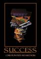
Successby SonifoComment by blindjustice: I really like this one- but are those reader's digest condensed books? you have too read the whole moby dick to get true book learnin smarts!Nice border, nice contrast and great lighting.and great choice of pumpkin yellow for the text.
You might want to rethink the colorof the top book. The placement of the top book is perfect. |
 Photographer found comment helpful. Photographer found comment helpful. |
| 12/30/2003 07:02:58 PM |
Successby SonifoComment by Kavey: Nicely put together - good colour choices for border and text. Not sure I like the perspective/ angle of view on the pile of books. |
| Photographer found comment helpful. |
| 12/30/2003 02:59:16 PM |
Successby SonifoComment by Dave Gordon: Are the books an illustration of the ladder to success? Nice blend of colors and composition. |
| Photographer found comment helpful. |
| 12/30/2003 10:49:58 AM |
|
| Photographer found comment helpful. |
| 12/30/2003 12:57:31 AM |
Successby SonifoComment by neenee1999: This would be a great motivational poster for an educational subject, I like it this looks very professional, the way the books are stacked adds dimesion and interest to this shot I like it |
| Photographer found comment helpful. |
| 12/29/2003 05:08:55 PM |
|
| Photographer found comment helpful. |
| 12/29/2003 03:22:21 PM |
Successby SonifoComment by W.R.Miller: I can definitely see this hanging in a library of a university or school to encourage students to study. Awesome photo and great quote. Good luck with the challenge!!! |
| Photographer found comment helpful. |
| 12/29/2003 02:46:25 PM |
Successby SonifoComment by Beagleboy: One of the best of the lot. Very good light and good clean focus throughout. I also love your title text with larger S's and underlining. However, your secondary title is almost properly aligned but is s tad too close to the right - I measured. |
| Photographer found comment helpful. |
| 12/29/2003 01:37:31 PM |
Successby SonifoComment by ronners: Very nice composition and use of light. I do think, however, that the title and text is too dominant - so much so that it overpowers the photo when the two should be able to coexist. |
| Photographer found comment helpful. |
| 12/29/2003 08:24:34 AM |
|
| Photographer found comment helpful. |
Home -
Challenges -
Community -
League -
Photos -
Cameras -
Lenses -
Learn -
Help -
Terms of Use -
Privacy -
Top ^
DPChallenge, and website content and design, Copyright © 2001-2026 Challenging Technologies, LLC.
All digital photo copyrights belong to the photographers and may not be used without permission.
Current Server Time: 06/18/2026 11:04:53 PM EDT.