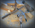
DPChallenge: A Digital Photography Contest You are not logged in. (log in or register
 
Browse Settings
Currently viewing:
Registered UserGreetmir

Show comments:

Per page:

Order:

Comments:


Comments Received by Greetmir
Pages:   ... ... [97]
Showing 331 - 340 of ~966
Image Comment
Resourceful Woodworking
05/01/2007 09:32:07 AM
Resourceful Woodworking
by Greetmir

Comment by poser:
I liked this I thought the idea was cool.
Photographer found comment helpful.
A Primarily Peaceful Spring
04/30/2007 10:09:07 PM
A Primarily Peaceful Spring
by Greetmir

Comment by magnus:
Great idea! But I wish the yellow flower weren't over-saturated to the point of loosing all texture.
Photographer found comment helpful.
A Primarily Peaceful Spring
04/30/2007 09:19:38 PM
A Primarily Peaceful Spring
by Greetmir

Comment by graphicfunk:
Very creative and peace to you.
Photographer found comment helpful.
A Primarily Peaceful Spring
04/30/2007 05:12:34 PM
A Primarily Peaceful Spring
by Greetmir

Comment by andrea22_als:
pretty shots...and nice unique perspective of using 3 in a circle
Photographer found comment helpful.
A Primarily Peaceful Spring
04/30/2007 04:56:34 PM
A Primarily Peaceful Spring
by Greetmir

Comment by Simms:
I like the inclusion of the CND/peace sign, but ultimately this image does nothing to excite me. The base images are clear and well processed though. 6
Photographer found comment helpful.
Resourceful Woodworking
04/30/2007 04:35:55 PM
Resourceful Woodworking
by Greetmir

Comment by raish:
Steve Davidson is right on the money as far as I'm concerned. For the idea, concept and set-up this is worth all the votes in the world, but then it doesn't quite make it as a photograph. I think a darker (and preferably non-reflective?) background might have helped, to set off and contrast with the chrome and stainless steel - where light's reflected off the corkscrew it's the same colour and tone as the background material.

It's too good for 5.6, in many ways, but I can't say it's wrong. Really enjoyed the picture though.
Photographer found comment helpful.
Resourceful Woodworking
04/30/2007 03:29:32 PM
Resourceful Woodworking
by Greetmir

Comment by levyj413:
I like the original way of using the kitchenware, and the layout is interesting. It's missing a little pizazz, though. Try bumping up the contrast and the other things that stdavidson suggested. I would've been torn between a 5 and 6, so 5.6 sounds about right.
Photographer found comment helpful.
A Primarily Peaceful Spring
04/30/2007 02:38:59 PM
A Primarily Peaceful Spring
by Greetmir

Comment by DrAchoo:
looks like the yellows oversaturated on you. the pink to a lesser extent. Cute creative triptych design. 5
Photographer found comment helpful.
Resourceful Woodworking
04/30/2007 12:07:00 PM
Resourceful Woodworking
by Greetmir

Comment by Artifacts:
Positives:
Very cleverly conceived idea; unique and fun. Great positioning of kitchenware with respect to its corresponding wood piece and the inclusion of sawdust is a nice touch.

Technicals:
Technicals are not as strong as they might for a composition as clever as this. Overall lighting, contrast and perspective are bland. Color is not bad, per se, but then there is nothing in it that attracts the eye outside the light blue.

The vignetting acts more as a distraction than as a support for the composition.

Sharpness is hard to judge. Though I can see some digitalization creeping in along sharp edges the sawdust itself seems very softly focused. Those two things counteract each other visually.

The Challenge:
This meets the challenge in a highly unique and cleverly conceived way. But the technical treatment is almost as though you expected the idea itself to carry the composition. The technicals held it back, particularly the strong vignette which seems to serve no purpose. Normally titles matter little, but something like "High Fiber Diet" would have helped the viewer to associate the kitchenware to the wood faster. First millisecond impression is that it does not meet the challenge.

Suggestions:
It is a great idea and there is much than can be done to bring all that out. Stronger and more angled lighting with more contrast would add considerable visual interest. Reshooting from a different perspective, perhaps closer to the plane of the table with some light background DOF might be worth consideration.

Dodge and burn on the wood grain to make it stand out more would create additional interest and visual support for your main theme. Proper focus is always a critical element in every photograph. To be honest, I have no idea how to handle it in this composition.

Vignetting
Vignetting generally speaking is a good addition for added visual impact of an image, but not the old fashioned kind we see in portraits from the late 19th and early 20th centuries. Yours has more in common with that than not and it looks unbalanced and offset. You want to back off its opacity. Subtlty is a virtue with vignettes and generally speaking setting the opacity of the layer it is on below 18% is a good idea or and/or widening its feathering. We often see on winning images vignettes that have been added that are subtle in their impact but support the image visually very well. Somtimes we see in those images that the photographer has made "hand" changes to the vignette specific to the image. All that you might consider for your own image.
Photographer found comment helpful.
Resourceful Woodworking
04/30/2007 11:32:31 AM
Resourceful Woodworking
by Greetmir

Comment by bmartuch:
What ever works. Right?
Photographer found comment helpful.
Pages:   ... ... [97]
Showing 331 - 340 of ~966


Home - Challenges - Community - League - Photos - Cameras - Lenses - Learn - Help - Terms of Use - Privacy - Top ^
DPChallenge, and website content and design, Copyright © 2001-2025 Challenging Technologies, LLC.
All digital photo copyrights belong to the photographers and may not be used without permission.
Current Server Time: 09/06/2025 09:40:55 AM EDT.