| Image |
Comment |
| 05/08/2007 08:18:28 AM |
|
 Photographer found comment helpful. Photographer found comment helpful. |
| 05/07/2007 08:40:20 PM |
A Primarily Peaceful Springby GreetmirComment by JuliBoc: Thank you for sharing your processing steps. I think the circular format is very interesting and will come in handy for me someday. I particularly like the vignetting that gives the triptych a slightly rounded look. Oh, and the flowers are pretty too. |
| Photographer found comment helpful. |
| 05/07/2007 03:13:37 PM |
|
| Photographer found comment helpful. |
| 05/07/2007 02:05:20 PM |
|
| Photographer found comment helpful. |
| 05/07/2007 09:49:53 AM |
|
| Photographer found comment helpful. |
| 05/07/2007 09:43:51 AM |
A Primarily Peaceful Springby GreetmirComment by Melethia: A unique approach to a triptych! I like the idea alot, though the green of the circle to me was a bit strong. For DPC with such limited space, it seems some was wasted by the circular design, but I do think you pulled it off well and did some good photoshopping to get there. |
| Photographer found comment helpful. |
| 05/07/2007 09:20:39 AM |
|
| Photographer found comment helpful. |
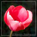
| 05/07/2007 09:20:06 AM |
Tulipby GreetmirComment by gazdi: The textures are sooo pleasing on the close part, I need more DoF to see it on the far parts too. |
| Photographer found comment helpful. |
| 05/07/2007 09:17:53 AM |
Hybrid Tulipby GreetmirComment by gazdi: I like these cold colors and I like the blown WHITE parts. The square crop suits well but not sure about the border. |
| Photographer found comment helpful. |
| 05/07/2007 02:17:21 AM |
A Primarily Peaceful Springby GreetmirComment by klstover: -Critique Club-
I agree with some of the comments below. I think that the three images taken individually are pretty nice. Together, however, there is not a visual impact that causes the viewer to be impressed.
I don't prefer the "peace sign" presentation - it causes me to focus more on your processing when I look at it than on your images - but I do like what you did with it in terms of having a darker area where the images are on the edge of the circle.
I also think the image is a little unbalanced as far as having two of the images have green backgrounds and one without. Perhaps choosing different pictures or a different layout would have suited this challenge better. Overall not a terrible entry, and one I am happy to have seen. |
| Photographer found comment helpful. |
Home -
Challenges -
Community -
League -
Photos -
Cameras -
Lenses -
Learn -
Help -
Terms of Use -
Privacy -
Top ^
DPChallenge, and website content and design, Copyright © 2001-2026 Challenging Technologies, LLC.
All digital photo copyrights belong to the photographers and may not be used without permission.
Current Server Time: 07/17/2026 10:15:47 AM EDT.