DPChallenge: A Digital Photography Contest You are not logged in. (log in or register
 
Browse Settings
Currently viewing:
Registered UserPhobic

Show comments:

Per page:

Order:

Comments:


Comments Received by Phobic
Pages:  
Showing 1 - 10 of ~15
Image Comment
To The Brim
06/23/2008 04:28:16 PM
To The Brim
by Phobic

Comment by xianart:
This is a Critique Club Critique!

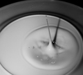
This is an interesting image; the long vertical line not a drop formation often seen. It is technically good, with focus, and exposure spot on. I quite like the composition, with the concentric circles more implied than shown. The leading line of the long drop (hah) brings the eye through and into the image and its circles again and again. The star, its incipient crown gives some nice tension to the composition.

Really, I think your main problem with this image, in this challenge, is that it's not really high contrast. High contrast should have strong blacks and whites, with a limited range of greys between, while yours has a full tonal range of greys. Generally, away from the whole high contrast thing, there's something seemingly missing in the back area (underside of a plate?), the tones just feel, empty. I'm not entirely sure why.

All in all, well done, and I think the low score is more to do with the normal contrast than anything else.

Cheers,

C.
To The Brim
06/17/2008 05:17:58 AM
To The Brim
by Phobic

Comment by wilburhere:
good for the attempt. 6 for hardwork.
To The Brim
06/15/2008 10:06:31 PM
To The Brim
by Phobic

Comment by cutout:
a bit old hat 7
To The Brim
06/13/2008 01:25:07 PM
To The Brim
by Phobic

Comment by epescala:
There is just not enough contrast for me. It looks very grey.
To The Brim
06/13/2008 12:16:52 PM
To The Brim
by Phobic

Comment by tpbremer:
nice splash, but really not that much contrast for a high contrast challenge.
To The Brim
06/12/2008 12:57:32 PM
To The Brim
by Phobic

Comment by IreneM:
Nice shot, love the tiny droplets at the top of the splash. Overall, I think it could have been a bit whiter. Good luck.
Don't Cry
02/07/2007 04:38:13 PM
Don't Cry
by Phobic

Comment by alifeinexile:
try not using on camera flash ever again.
Don't Cry
02/07/2007 10:03:56 AM
Don't Cry
by Phobic

Comment by Phobic:
Thanks for the comments, yes I struggled to get the a real Shallow DOF in the shot.

intentionally washed out the colours to bring out the ironic dark nature of the subject matter

yes it's a bonsai!
Don't Cry
02/06/2007 02:20:55 PM
Don't Cry
by Phobic

Comment by chris_u:
The lighting doesn't do it a ton of justice. Good thinking on the concept though.
Don't Cry
02/02/2007 01:26:05 AM
Don't Cry
by Phobic

Comment by skylercall:
The background isn't out of focus enough for it to have a real affect on the image.
Pages:  
Showing 1 - 10 of ~15


Home - Challenges - Community - League - Photos - Cameras - Lenses - Learn - Help - Terms of Use - Privacy - Top ^
DPChallenge, and website content and design, Copyright © 2001-2025 Challenging Technologies, LLC.
All digital photo copyrights belong to the photographers and may not be used without permission.
Current Server Time: 08/15/2025 12:46:44 AM EDT.