| Image |
Comment |
| 05/08/2007 11:16:32 PM |
|
 Photographer found comment helpful. Photographer found comment helpful. |
| 05/08/2007 07:53:00 PM |
Laundry Dayby HipychikComment by colorcarnival: love the texture of the background. i personally like the processing you used on the top left (because it makes the image pop out of the pastel setting), but there is a dark spot on her forehead. My fave tho is the bottom pic, purely for the candid moment. |
| Photographer found comment helpful. |
| 05/08/2007 07:50:44 PM |
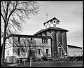
Memoriesby HipychikComment by sherpet: I like these type of historical archectural images..... especially in black and white..... Message edited by author 2007-05-08 19:51:07. |
| Photographer found comment helpful. |
| 05/08/2007 02:06:42 PM |
|
| Photographer found comment helpful. |
| 05/08/2007 02:05:15 PM |
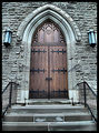
Welcomeby HipychikComment by LalliSig: Not a DNMC from me but this shot is still not really as symmetrical as it could have been, the subject is perfect but the distortion in the steps kindof offsets it. I do like the tones in the shot and contrast is spot on, gave a 6. |
| Photographer found comment helpful. |
| 05/08/2007 11:55:21 AM |
|
| Photographer found comment helpful. |
| 05/08/2007 11:20:47 AM |
Memoriesby HipychikComment by Alicia: Very nice subject and your PP is amazing. The shadows on the building add to the depth of the photo. I love this. |
| Photographer found comment helpful. |
| 05/08/2007 11:08:50 AM |
Memoriesby HipychikComment by noraneko: Hi Hipychik - the contrast is really pleasing here, and I like the textures and shapes, especially the star on top of the silo. I agree with Muckpond that it feels a little skewed, though. |
| Photographer found comment helpful. |
| 05/08/2007 09:19:42 AM |
Memoriesby HipychikComment by muckpond: i would try to adjust the perspective of this a little bit so the building isn't so leany. and i'd clone out the sign on the side because that really interferes with the "timelessness" of the shot. great coloring and contrast, though. :) |
| Photographer found comment helpful. |
| 05/08/2007 08:31:03 AM |
Memoriesby HipychikComment by Bruce_the_Robert: Neat shot, and even though some of the whites are blown out, this makes it look intentionally harsh, rather than overexposed. The building does seem to be leaning back or to the left a bit, but overall the tones and the textures make this a really nice image. |
| Photographer found comment helpful. |
Home -
Challenges -
Community -
League -
Photos -
Cameras -
Lenses -
Learn -
Help -
Terms of Use -
Privacy -
Top ^
DPChallenge, and website content and design, Copyright © 2001-2026 Challenging Technologies, LLC.
All digital photo copyrights belong to the photographers and may not be used without permission.
Current Server Time: 07/23/2026 09:08:17 PM EDT.