| Image |
Comment |
| 09/16/2007 01:41:49 PM |
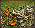
Flowers & Fungusby HipychikComment by liberty: Nice image, I like the subject matter, Some of my favorite colors for flowers. Great composition, lovely colors, nice lighting.
BTW, I live in Southwest Michigan, 1 hour south of Kalamazoo, and like 20 minutes from the Indiana state line. I've always been intersted in living up north in Michigan, but family prevents that. It always makes a great road trip, especially the fall colors. |
 Photographer found comment helpful. Photographer found comment helpful. |
| 09/16/2007 12:03:37 PM |
|
| Photographer found comment helpful. |
| 09/16/2007 11:56:09 AM |
|
| Photographer found comment helpful. |
| 09/16/2007 11:35:37 AM |
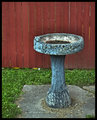
Birdbathby HipychikComment by EstimatedEyes: Hmmm, seems like I've seen this one before ... a subject in a past challenge maybe? I like it. I think it would be nice shot from a little lower angle and cutting out the concrete pad, so you just see nice lines of green grass and red fence forming a nice background for the birdbath. Throw a golden eagle in the bath, and you've got a blue ribbon in the free study! :>P |
| Photographer found comment helpful. |
| 09/16/2007 11:33:07 AM |
|
| Photographer found comment helpful. |
| 09/16/2007 11:06:11 AM |
Birdbathby HipychikComment by raish: Good old hippy philosophy, man - baths are for the birds.
It's a nice piece - wears its age... |
| Photographer found comment helpful. |
| 09/16/2007 11:04:50 AM |
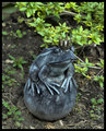
The Princeby HipychikComment by raish: You do wipe that thing clean before and after kissing it now don't you? I know you do. :) |
| Photographer found comment helpful. |
| 09/16/2007 11:03:49 AM |
Flowers & Fungusby HipychikComment by raish: The picture is in the fungus and the flowers. You've kept their texture and real colour without going over-saturated and glossy (the sort of pitfall that gets me all the time). Crop a fifth off top and right? Who knows. It's still a powerful good shot with said colours and textures... |
| Photographer found comment helpful. |
| 09/16/2007 09:54:59 AM |
|
| Photographer found comment helpful. |
| 09/16/2007 09:18:26 AM |
Flowers & Fungusby HipychikComment by JuliBoc: I like the cheerful bright flowers. I also like the fungus. Something about the top of the stump bothers me. It is a little hard for my eye to process, perhaps there is too much contrast there or too much sharpening. |
| Photographer found comment helpful. |
Home -
Challenges -
Community -
League -
Photos -
Cameras -
Lenses -
Learn -
Help -
Terms of Use -
Privacy -
Top ^
DPChallenge, and website content and design, Copyright © 2001-2026 Challenging Technologies, LLC.
All digital photo copyrights belong to the photographers and may not be used without permission.
Current Server Time: 07/26/2026 04:53:46 PM EDT.