Climbing to the top!by
WriteHeartComment by purpleflutterby13: Greetings from the Critique Club.
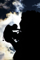
Wow, what a beautiful image! I gave it a 7 during voting, and it probably deserved higher.
Striking subject matter, definitely contre jour, and the clouds have alligned so beautifully...
The composition is somewhat imbalanced - there are a lot more dark areas than light ones (hence the comment about wanting more sky). However, I think this benefits the image. Because of the imbalance, the mountain looks very imposing, and the dark sky above it adds to the effect, with the white cloud giving this lovely aura of light to the struggling climber. The focus is good, and the fast shutter speed worked great - I love the level of sharpness and detail that the silhouette has, especially the chain hanging off his belt. Nice use of the rule of thirds too.
In general, I think people prefered images that weren't just silhouettes, but had a second, more gentle source of light that gave some detail to the subject. However, the advantage of using silhouettes is that, while it removes some of the reality of the subject matter, it gives it an iconic appearance, making it a lot more symbolically powerful. What I see in this image:
I have what could possibly be my last ever exam in 3 days. And I've been struggling under a ton of revision for days now. I requested another image to critique during a revision break, had a look at it, and let it linger around in my mind for another revision session before coming back to it. And it really moved me, I found I could actually identify with it. The struggle of the rock climber, the need for perseverence, the fact that the top was so close, yet getting to it still seems so difficult. I think there are a lot of life situations like that, where people could really identify with this image and the need to be strong, and to go out and find beauty. Very Nietszchean actually - the quest for freedom, the will to power, self-fulfilment, there's all sorts of things you could read into it.
In terms of the editing, what I normally do is as follows:
-In PhotoShop, use adjustment layers for each adjustment you do. Standard ones I go through with pretty much every photo: levels, curves, brightness/contrast, hue/sat, trying out a partial desat with the channel mixer, selective colour (in this case I might have messed around with the blues and yellows), unsharp mask. The great appeal of adjustment layers is the little eye symbol at the left hand side of each one - when you press it, it shows you what the image would look like without that particular adjustment. So I go through all the adjustments, twiddle with the settings until they seem to make the photo better, but then go through them again using the eye symbol to check whether they genuinely benefit the image. If they don't, get rid of them. In this case, I don't think the image actually needed any further editing.
Anyway, hope this helps. PM me if you have any questions.
And well done on a fantastic image, and your new well deserved personal best.
Jelena