Gateway to the Westby
kaysrivComment by ursula: From the Critique Club,
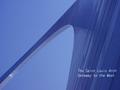
First impression: Wow, what a cool perspective! And all blue. The words are out of place.
Composition: Unique, different, great use of space. I've been to St. Louis, and up into the arch (long time ago), and this picture captures the feeling of the place very well.
Technical: Focus is good. I would have liked the contrast to be a bit higher (blues of sky vs. blues of arch). Wonderful how you got such a big blue sky with hardly any noise.
Overall: I wouldn't change anything in the picture, except (maybe) to brighten it up just a little. The words on the other hand look a bit "tacked on", and it's the words that probably cost you a higher score in this challenge. Please don't take this wrong, but the picture is bold, beautiful, it reaches out into the sky - the words look kinda "wimpy" by contrast. The good news, now you can experiment with it!
Keep up the good work! Take care,
Ursula I Abresch
BTW - not that I don't like your pictures, they're beautiful, but I hope you get someone else (for variety) on your next critique :)