| Image |
Comment |
| 07/15/2007 10:47:17 AM |
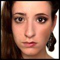
between Liesby lovethelightComment by Sheryll: I don't think your title is helping this amazing shot. Maybe something like before and after makover would have worked? Although I'm sure she put on make up, did her hair and put on the earring on one side only I can still tell that some of her beauty on the made up side is from editing because of the lack of red lines in her eye on the made up side. If you had left in just a hint more of them I wouldn't have known for sure. Great job overall on this really though. Just my little nitpicks. 8 |
 Photographer found comment helpful. Photographer found comment helpful. |
| 07/14/2007 09:38:20 PM |
between Liesby lovethelightComment by Scholten: Very clever! It really whiplashed my eyes going back and forth between the two sides. My mind was denying that the left side could be the same person as the right, but my eyes were telling me it was. How much of what our eyes see is just... made up!?!? So much "reality" gets covered up and hidden! We never see it! A photo that can reveal that the way this one does is worth a 10! Good job! |
| Photographer found comment helpful. |
| 07/11/2007 11:14:39 AM |
between Liesby lovethelightComment by boyd2000: Wow! Amazing picture and visual display of a dichotomy. I can't figure out how this was done with a single shot unless the woman actually was made up like that with her left side glammed out and the right side as undone as possible. I see a ribbon on this one. |
| Photographer found comment helpful. |
| 07/10/2007 04:23:26 PM |
|
| 07/10/2007 03:56:29 PM |
|
| 07/10/2007 03:35:49 PM |
|
| Photographer found comment helpful. |
| 07/10/2007 12:27:26 PM |
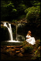
Sanctuaryby lovethelightComment by Haneck: exquisite colors. I love the golden color on the rocks, and the way it goes with the green. The color harmonies are beautiful - the white dress matches the waterfall, and the gold and green is in the rocks above and below, tying everything into a breath-taking, glorious shot. And the subtle tones... Wonderful! Definitely should have scored higher, but you never know with the voters! :)
The gold tones reminded me a little bit of this... sort of?
 Message edited by author 2007-07-10 12:30:59. Message edited by author 2007-07-10 12:30:59. |
| 07/09/2007 05:47:15 PM |
|
| Photographer found comment helpful. |
| 07/09/2007 04:26:49 PM |
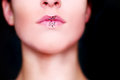
Lipsby lovethelightComment by freakin_hilarious: This is a cool idea. I like it. Since you asked for feedback, I'll lay it on ya!
Good things:
The general concept is great. I like the idea of interesting lips and/or funky things on the lips.
Cool color and processing in general.
Things I would change:
DOF seems way too shallow to me. I generally love a super thin DOF, but I think it's too thin here. I would prefer to see all of the lips nice and sharp. As it is, the corners of the mouth are already out of focus.
I think I would like to see a little bit more of the nose just to give the nostrils a bit more context.
The pose is begging to be symmetrical, yet it isn't quite. It looks like it was supposed to be and you missed by a bit.
I think that's it. Don't get me wrong regarding the changes above, I think it's a great photo! |
| Photographer found comment helpful. |
| 07/09/2007 04:21:36 PM |
Lipsby lovethelightComment by AJSullivan: I like the overall image, but like you, im not crazy about the design on the lips. I also like the idea of the series youre shooting for. |
| Photographer found comment helpful. |
Home -
Challenges -
Community -
League -
Photos -
Cameras -
Lenses -
Learn -
Help -
Terms of Use -
Privacy -
Top ^
DPChallenge, and website content and design, Copyright © 2001-2026 Challenging Technologies, LLC.
All digital photo copyrights belong to the photographers and may not be used without permission.
Current Server Time: 07/17/2026 05:54:04 PM EDT.