All Saints' Churchby
e301Comment by stephan: Greetings from the Critique Club, Ed.
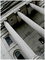
Composition: Of course the angle is the most outstanding feature of the photo. I like it because it makes the photo different and interesting. I like that but it seems a bit unmotivated. It's not apparent why you chose the angle. I rotated it in my image editor and it looked rather boring in a normal angle. Also the subject doesn't seem to fit to that chaotic and strange angle. A bar a night with neon signs or something like that would have been better. However, the composition is good. The diagonals do their work and the clock in the corner is great.
Lighting: The photo looks a bit bland. I would like to see more contrast, especially in the pillars.
Focus: Some parts look a bit soft. I'm not sure of it comes from the aperture or from Neatimage, but the overall focus is ok.
Challenge: The photo sure fulfills the challenge theme. Now I have an idea why you possibly have used that angle. That diagonal composition makes it possible to "cram" much more of the church into the frame and thus visually filling the frame to a greater extent. If that really was your intention then I think it worked. But unfortunately your comments don't tell us your reason. When stirring up so much controversy, I think we deserve a denouement (is that the correct word?) ;-)
Creativity: Having the courage and trying such an unusual angle is creative in my opinion. I hope you aren't deterred by the score and stop doing such more "experimental" shots.
Good luck for your future challenges,
Stephan