DPChallenge: A Digital Photography Contest You are not logged in. (log in or register
 
Browse Settings
Currently viewing:
Registered Usere301

Show comments:

Per page:

Order:

Comments:


Comments Received by e301
Pages:   ... [473] [474] [475] [476] [477] [478] [479] ... [509]
Showing 4751 - 4760 of ~5088
Image Comment
Coffee and light
08/18/2003 10:08:56 PM
Coffee and light
by e301

Comment by GolferDDS:
Well balanced. Interesting picture and play on light.
Photographer found comment helpful.
Coffee and light
08/18/2003 12:44:54 PM
Coffee and light
by e301

Comment by Ten13:
Wow, this really has an impact. I love it. It's almost abstract until the image becomes clear. Very very nice work!
Photographer found comment helpful.
Coffee and light
08/18/2003 06:09:02 AM
Coffee and light
by e301

Comment by hortopth:
This is great! (not you Tarique, is it?). This is real top stuff. The only thing I can think of, is having that slight glare bump on top of the light circle (on the top) removed. I only say that, because the rest of it is made of of very clean, smooth, geometric shapes. The symmetry works well with this too. 9
Photographer found comment helpful.
Coffee and light
08/18/2003 04:08:57 AM
Coffee and light
by e301

Comment by colorosilence:
I think I would've preferred seeing only the coffee, now the light steals too much attention.
Photographer found comment helpful.
Coffee and light
08/18/2003 12:39:43 AM
Coffee and light
by e301

Comment by pitsaman:
looks like pic taken with oly5050 10 from me !
Photographer found comment helpful.
Coffee and light
08/18/2003 12:29:03 AM
Coffee and light
by e301

Comment by paganini:
i think it'd be better image without the light. 7
Photographer found comment helpful.
Imagine...
08/17/2003 07:58:05 PM
Imagine...2nd Place
by e301

Comment by stephan:
Greetings from the Critique Club, Ed! :)

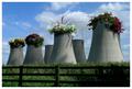
Composition: I think the composition is great. I also like the fence. It gives the photo it's rural "setting" which makes your trick more plausible, because it really looks as if it's an abandoned nuclear power plant in the country. It also adds a perspective and depth to the image to see the fence in the foreground in relation to the towers in the background.

Lighting: Well, sunny weather is always nice. I see a good use of shadows. The lighting from the side creates shadows on the towers which make them look more plastic. This added depth again prevents the image from looking flat.
You also did a great job of adding the proper shadows of the flowers to the image. I think the lighting is the most difficult part of such fake photos. That's what decides whether the illusion is successfull or not. If the lighting looks out of place then people won't accept it. And to me it looks very real!
The only nitpicking thing I can find is the darker area in the lower right corner. It's not distrating or aother wise a big deal, but still I would like to see it being the same lighting as the other part of the fence.

Focus: I don't know what aperture you used for your "base" image of the fence+towers photo but it probably was a small one. The depth of field is very wide which is good because you really need everything in focus here. Normally photos tend to look a bit flat then but there are other things to prevent this (see above). The only noticeable focus issue I don't like is that some areas on the flowers on the two leftmost towers look a bit too soft. It seems they don't match the focus of the tower they're sitting on.

Challenge: You met the challenge very well. It's a great idea to convey this theme. It's something many people immediately understand. Personally I hope that this future will come true :) I'm sure this photo would work good as an advertising. It also would be a great poster for the election campaign of the greens!

Creativity: No question. This is really creative! First your matrix entry, now this. You really have great ideas! I knew why I added you to my favourite photographer list (already in april) ;-)

I look forward to your future photos. Good luck!
Stephan
Photographer found comment helpful.
Imagine...
08/17/2003 01:18:29 PM
Imagine...2nd Place
by e301

Comment by joanns:
Hi Ed, I have to say that this is my favorite. First of all, the PS work is seemless but I love the message and the irony. Beautifully composed. Oh, and the shadows! Brilliant. Congratulations on your placement.
Photographer found comment helpful.
The Back Rivers
08/17/2003 03:57:20 AM
The Back Rivers
by e301

Comment by justesme:
Interesting, but desolation? No... It looks nice and peaceful. Also the modern pylons and skyscrapers just ruin the feel of this great place.

Perhaps the contrast is also too high and I would have loved to see more detail on the hut on the right.

However, well done. Good try =)
Photographer found comment helpful.
The Back Rivers
08/17/2003 02:16:26 AM
The Back Rivers
by e301

Comment by 'Pong:
I guess you pushed contrast too much. The sky is breached whil in th shadow is black out. Good use of perspective though
Photographer found comment helpful.
Pages:   ... [473] [474] [475] [476] [477] [478] [479] ... [509]
Showing 4751 - 4760 of ~5088


Home - Challenges - Community - League - Photos - Cameras - Lenses - Learn - Help - Terms of Use - Privacy - Top ^
DPChallenge, and website content and design, Copyright © 2001-2025 Challenging Technologies, LLC.
All digital photo copyrights belong to the photographers and may not be used without permission.
Current Server Time: 06/20/2025 09:33:27 AM EDT.