| Image |
Comment |
| 10/07/2007 12:42:36 AM |
Rememberance of our Youthby lantagaComment by Tammer: With all the open space in your image, this would make a good photo for a travel billboard. the upper left corner seems a little dark to me, but I like the composition. |
 Photographer found comment helpful. Photographer found comment helpful. |
| 10/06/2007 06:54:37 AM |
|
| Photographer found comment helpful. |
| 10/03/2007 10:58:05 PM |
|
| Photographer found comment helpful. |
| 10/03/2007 10:11:58 PM |
|
| Photographer found comment helpful. |
| 10/03/2007 06:07:39 PM |
|
| Photographer found comment helpful. |
| 10/03/2007 12:32:08 PM |
|
| Photographer found comment helpful. |
| 10/01/2007 02:27:34 PM |
|
| Photographer found comment helpful. |
| 10/01/2007 01:12:00 PM |
Rememberance of our Youthby lantagaComment by HeiSch: I look at your picture and feel that something does not fit. Dn't get me wrong, technically your pciture is sound and solid. When I was the little girls age, I thought the waves were HUGE and the beach endless. Somehow the perspective of your picture does not support the title. Beuatiful colors and placement of your models |
| Photographer found comment helpful. |
| 04/02/2007 01:09:08 AM |
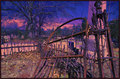
Broken Exitby lantagaComment by Shrink: Interesting but cluttered photo. One word of advice: Simplify.
Next time you look at any photo, observe where your eyes move to. Analyze your eyes movements. Generally, in good photos, your eye is lead from one object to the next in a circular motion all around the picture, and kept inside the picture frame. The brain searches for meaning in the picture, but doesn't like to be confused, by subjects leading your eyes nowhere, or out of the picture The picture should feel "coherent". The clutter in the bottom of the picture ?Brambles, are confusing and not pleasing. The pinkish stone column, doesn't make much sense until you realize it is a monument in a graveyard, but the evidence of the other graves is too small. Sorry, I had to work too hard to see them, even then I cant be sure that it is a graveyard. The background trees are green and/or blue, those colors are confusing. I like the big tree, but the top is cut off so leads the eyes out of the picture. That tree itself may have made an interesting photo, I like what I see of it. The top of the gatepost is cut off, again leading the eye out of the picture. Try not to cut ends of things off. I also really like the rusted gate, the rails and the foreground pile of leaves. I would have concentrated on some of these details, and tried to find a simple composition.I like the rusted spikes, I may have looked for a repetitive pattern in these to simplify the composition. You could have cleared the twigs and brush from the railed in area, that certainly may have helped to simplify the foreground a lot. By changing position I think I would have tried not have the large Pink column on the right in the picture at all. I would try an find one focal point to help the eye to get back to. In this picture, I cant see one. I'm not sure the false color add to the image, to me it confuses not clarifies. What do you want the picture to say to me the viewer? Will it get across to me what you feel when you take the photo? Just my 2 cents, for what its worth. Each to his own. Enjoy. |
| Photographer found comment helpful. |
| 03/07/2007 01:46:02 AM |
|
| Photographer found comment helpful. |
Home -
Challenges -
Community -
League -
Photos -
Cameras -
Lenses -
Learn -
Help -
Terms of Use -
Privacy -
Top ^
DPChallenge, and website content and design, Copyright © 2001-2026 Challenging Technologies, LLC.
All digital photo copyrights belong to the photographers and may not be used without permission.
Current Server Time: 07/16/2026 07:14:28 AM EDT.