| Image |
Comment |
| 10/03/2013 02:00:49 AM |
|
 Photographer found comment helpful. Photographer found comment helpful. |
| 10/02/2013 11:11:36 PM |
|
| Photographer found comment helpful. |
| 10/02/2013 11:52:16 AM |
In the gardenby hajekaComment by sfalice: Lovely colors here. Good expression and those green eyes against the b'ground. Most of the interest is in the head and shoulder area and this section could stand alone nicely and be a strong image. |
| Photographer found comment helpful. |
| 10/02/2013 10:18:02 AM |
|
| Photographer found comment helpful. |
| 09/30/2013 04:35:41 PM |
|
| Photographer found comment helpful. |
| 09/30/2013 03:54:10 PM |
Sheep with fenceby hajekaComment by smudgeSMJ: Wonderful composition and execution. I love the way the sheep stands out against the background, clear and crisp without taking away from the majesty of the landscape. |
| Photographer found comment helpful. |
| 09/30/2013 01:54:44 PM |
|
| Photographer found comment helpful. |
| 09/28/2013 08:14:56 PM |
|
| Photographer found comment helpful. |
| 09/28/2013 11:11:41 AM |
|
| Photographer found comment helpful. |
| 09/27/2013 08:48:41 PM |
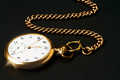
Remake of "Timeless" Classic (170276)by hajekaComment by CNovack: Voted earlier coming back to comment.
I like that the redux has some 'texture' to the ground that gives this pocketwatch a foundation to lay on whereas the original seems to be floating in negative space. There is more detail in the pocketwatch all the way up to the chain. Love the sparkles coming off the watch - a nice touch to keep because it adds zing to the composition. I think that both the original and the redux would have had a bit more visual impact had the chain come out of the right top corner. That way you would have the subject lined up on the diagonal letting the eye easy and naturally travel up and down the subject - from the beginning of the chain in the top right corner following the chains path down to the pocketwatch that is in the bottom left corner. Lastly, I think that this rendition would have even more visual impact if the watch face was oriented more towards the viewer instead of turned away- I would give the impression it is coming in our direction and also be easier to appreciate and read the details on the clock face. |
| Photographer found comment helpful. |
Home -
Challenges -
Community -
League -
Photos -
Cameras -
Lenses -
Learn -
Help -
Terms of Use -
Privacy -
Top ^
DPChallenge, and website content and design, Copyright © 2001-2026 Challenging Technologies, LLC.
All digital photo copyrights belong to the photographers and may not be used without permission.
Current Server Time: 05/16/2026 12:01:52 PM EDT.