| Image |
Comment |
| 07/08/2007 04:19:19 PM |
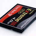
Day 08by hajekaComment by rachelellen: *wipes drool*. I'm still jazzed about my 1GB card. Ask me why I don't shoot in RAW. :)
Very nice product shot. :) |
 Photographer found comment helpful. Photographer found comment helpful. |
| 07/08/2007 02:09:43 PM |
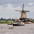
Day 07by hajekaComment by cgino: I love windmills! (maybe because I've never seen one in real life? :-)
I really like the composition in this image, my eye is drawn to the windmill then wanders down the left diagonal to take in each of the progressively smaller boats... very enjoyable shot! |
| Photographer found comment helpful. |
| 07/08/2007 12:22:53 PM |
Day 08by hajekaComment by cgino: Perfect product shot, I'd buy one! (but then I'd have to go back to the store because I use SD cards... :-) |
| Photographer found comment helpful. |
| 07/08/2007 12:21:43 PM |
|
| 07/08/2007 11:28:18 AM |
Day 07by hajekaComment by bs-photos: I would love to see one of those windmills! Looks like it was a beautiful day. |
| Photographer found comment helpful. |
| 07/08/2007 10:55:51 AM |
Day 07by hajekaComment by Alicia: Very "Dutch"! I've spent a lot of time in Holland and this brings up happy memories. Beautiful photo. |
| Photographer found comment helpful. |
| 07/08/2007 08:48:36 AM |
Day 07by hajekaComment by WalesP: This photo if full of happiness. The water, the windmill, and all those different kinds of boats (especially the kayak out in front of that big guy). Wonderful.
|
| Photographer found comment helpful. |
| 07/08/2007 08:05:17 AM |
|
| Photographer found comment helpful. |
| 07/08/2007 07:13:28 AM |
Day 07by hajekaComment by Germaine: Great "a day on the water" shot. I really like that guy in the tiny kayak. |
| Photographer found comment helpful. |
| 07/08/2007 02:17:18 AM |
Day 07by hajekaComment by Ken: Overall this shot seems "busy" but it there's a lot of interesting stuff to look it. |
| Photographer found comment helpful. |
Home -
Challenges -
Community -
League -
Photos -
Cameras -
Lenses -
Learn -
Help -
Terms of Use -
Privacy -
Top ^
DPChallenge, and website content and design, Copyright © 2001-2026 Challenging Technologies, LLC.
All digital photo copyrights belong to the photographers and may not be used without permission.
Current Server Time: 06/25/2026 08:54:50 PM EDT.