| Image |
Comment |
| 01/13/2007 04:28:31 PM |
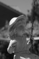
Statue Portraitby SomeamateurComment by MilesW: I find the light bar (fence top?) running behind the shoulders is a bit distracting. Hard to get rid of I know, but with the face in shadow that sort of highlight draws my eye away fromt the face. |
 Photographer found comment helpful. Photographer found comment helpful. |
| 01/12/2007 04:55:12 PM |
|
| Photographer found comment helpful. |
| 01/12/2007 10:17:47 AM |
|
| Photographer found comment helpful. |
| 01/12/2007 08:59:36 AM |
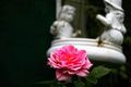
A Rose For a Coupleby SomeamateurComment by KarenNfld: Image seems off balance. Lots of dark space on the left that really doesn't add anything to the photo. I find the OOF statue in the background distracting and the rose seems too centered. |
| Photographer found comment helpful. |
| 01/12/2007 08:01:48 AM |
|
| Photographer found comment helpful. |
| 01/12/2007 07:17:50 AM |
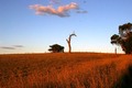
I Think I Can! I think I Can!by SomeamateurComment by atupdate: Hello from the Critique Club,
You received several comments during the challenge that point out that your image looks flat, washed out, etc. Adding contrast and saturation would help considerably. Not knowing what post processing software you are using, it is a bit hard to walk you through the steps to help this image. Many programs offer an autofix or autobalance option that would help some. If you are using a program with Levels or Curves, I would be more than happy to tweak your image and provide the steps taken to get there. Just send me a PM with your software type and we can start working on it.
One thing you can do on your own with this image to strengthen it is to crop it differently to see how the composition (look and feel of the image) changes. Since the sky has no real features that are interesting, it would help to minimize the sky as much as possible. As is, it is just dead space that adds nothing to the image composition. I would also suggest cropping the left side of the image to remove a significant amount of the bush. As is, it is as tall as the train and fights for the attention of the viewer. An added benefit of cropping off some of the left side is that the train will appear more to be moving through your image from the left to the right. With the train centered in the composition, it feels like it is parked.
Feel free to PM me if you have any questions regarding this critique.
Tim
|
| Photographer found comment helpful. |
| 01/11/2007 11:08:57 PM |
|
| Photographer found comment helpful. |
| 01/11/2007 08:10:37 AM |
|
| Photographer found comment helpful. |
| 01/11/2007 01:11:38 AM |
|
| Photographer found comment helpful. |
| 01/11/2007 12:24:36 AM |
|
Home -
Challenges -
Community -
League -
Photos -
Cameras -
Lenses -
Learn -
Help -
Terms of Use -
Privacy -
Top ^
DPChallenge, and website content and design, Copyright © 2001-2026 Challenging Technologies, LLC.
All digital photo copyrights belong to the photographers and may not be used without permission.
Current Server Time: 07/18/2026 12:57:36 AM EDT.