| Image |
Comment |
| 06/25/2007 06:38:15 PM |
Jesusby SnakeComment by Sheryll: A little more negative space on this one would make it a better shot. Also try increasing contrast and working with the shadows and highlights a little to make it pop a little more and not so hazy. |
 Photographer found comment helpful. Photographer found comment helpful. |
| 06/24/2007 01:45:53 AM |
Jesusby SnakeComment by mpeters: While there is some negative space present, I'm not sure that it is quite enough to really set off the subject. |
| Photographer found comment helpful. |
| 06/23/2007 11:15:08 AM |
Jesusby SnakeComment by bergiekat: Very nice capture. Perhaps adjust the levels a bit to make your coloring a touch less yellow. Your clouds would be brighter. :) |
| Photographer found comment helpful. |
| 06/22/2007 10:31:50 PM |
Jesusby SnakeComment by JeffDay: good idea for the challenge and fairly good composition. |
| Photographer found comment helpful. |
| 06/21/2007 11:59:53 PM |
|
| 06/21/2007 10:39:25 PM |
|
| Photographer found comment helpful. |
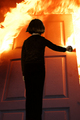
| 06/20/2007 09:42:26 PM |
Firestarterby SnakeComment by eschelar: A couple of things I noticed:
#1 focus is good on the door. Soft on the child. This works perfectly for this shot... gives a bit of an 'off' feeling to the child. Being underexposed is quite normal and natural for the 'other side' of the light... This is not intended to be a beautifully lit portrait.
#2 the insertion of the child into the shot is very well done. Needs a tiny bit of a feather or something around the head on the right side... there's a bit of hue or something from the original pic left that gives a bit of 'cutout' look.
#3 a bit of a distraction in the top left quadrant in the flame, about a third of the way down near the edge... this is the only thing that gets you thinking about the background that would normally be around the door. Get rid of that and the illusion is complete.
All in all a truly excellent work! Message edited by author 2007-06-20 21:45:00. |
| Photographer found comment helpful. |
| 06/19/2007 10:54:44 PM |
|
| Photographer found comment helpful. |
| 06/19/2007 08:50:17 AM |
I Do...by SnakeComment by inshaala: bit too much of a yellow colour cast over the whole image - if you dont have an image eiting program to fix it - watch your white balance when taking the shot. If it was intentional then you know that, but i'm still not a fan. |
| Photographer found comment helpful. |
| 06/17/2007 09:38:41 PM |
|
| Photographer found comment helpful. |
Home -
Challenges -
Community -
League -
Photos -
Cameras -
Lenses -
Learn -
Help -
Terms of Use -
Privacy -
Top ^
DPChallenge, and website content and design, Copyright © 2001-2026 Challenging Technologies, LLC.
All digital photo copyrights belong to the photographers and may not be used without permission.
Current Server Time: 07/18/2026 07:22:20 PM EDT.