| Image |
Comment |
| 07/18/2003 06:18:40 AM |
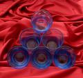
Geometryby chickadeeComment by mbardeen: Interesting, but I feel the background really detracts. A smooth red background would have highlited the subjects more. I do like the interaction between the glasses on the bottom and the fabric tho. |
 Photographer found comment helpful. Photographer found comment helpful. |
| 07/17/2003 09:40:06 PM |
|
| Photographer found comment helpful. |
| 07/16/2003 04:04:33 PM |
|
| 07/16/2003 10:59:59 AM |
|
| Photographer found comment helpful. |
| 07/16/2003 01:37:30 AM |
Geometryby chickadeeComment by brettd: This is good, maybe a larger apeture to blur the background a little would put more emphasis on the subject. |
| Photographer found comment helpful. |
| 07/16/2003 12:37:31 AM |
|
| Photographer found comment helpful. |
| 07/08/2003 05:54:43 PM |
page 1031 on SPEEDby chickadeeComment by wewillexplore: I don't like the post processing done to this shot. I'm into all kinds of photography, but this kind doesn't grip me. Maybe a diagonal composition would help some... |
| 07/08/2003 04:49:31 AM |
|
| 07/07/2003 10:18:36 PM |
|
| 07/07/2003 06:54:15 PM |
page 1031 on SPEEDby chickadeeComment by Lustre: I really like the way the key words stand out although I think a different title may have explained your purpose better. |
| Photographer found comment helpful. |
Home -
Challenges -
Community -
League -
Photos -
Cameras -
Lenses -
Learn -
Help -
Terms of Use -
Privacy -
Top ^
DPChallenge, and website content and design, Copyright © 2001-2026 Challenging Technologies, LLC.
All digital photo copyrights belong to the photographers and may not be used without permission.
Current Server Time: 07/16/2026 10:10:51 PM EDT.