| Image |
Comment |
| 05/07/2009 04:24:37 PM |
Colors Of Springby bubeltrubelComment by MaryO: Composition and color are nice and I like the DOF for the most part, but I'm not a fan of the big OOF area in the foreground. |
 Photographer found comment helpful. Photographer found comment helpful. |
| 05/04/2009 09:50:32 PM |
|
| Photographer found comment helpful. |
| 05/04/2009 07:41:54 AM |
Colors Of Springby bubeltrubelComment by Teafran: With a little softer focus, this would have been a brilliant image in the post-modernist impressionism genre of photography. It's very effective and the background has a painted feel to it very remeniscent of Claude Monet or Thomas Dowling. A very effective image with a lot of artistic impact in addition to it's technical success. Well done. |
| Photographer found comment helpful. |
| 05/03/2009 09:41:23 PM |
|
| Photographer found comment helpful. |
| 05/03/2009 09:07:53 PM |
|
| Photographer found comment helpful. |
| 05/01/2009 04:34:59 PM |
|
| Photographer found comment helpful. |
| 04/14/2009 07:23:51 PM |
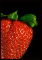
Süßes Früchtchenby bubeltrubelComment by Sheryll: I think this is one of the better shots in the challenge of the strawberries. The color seems more true to the fruit. The green leafs are much better represented here. However the same thing I said with the others applies here too. Diffusion of the light would help to make it a better shot imo. leaving your light where it is just putting a thin piece of waxed paper between the light and the strawberry would get rid of those bright reflective spots. I think it would be a better shot that way. Well done overall. |
| Photographer found comment helpful. |
| 04/14/2009 09:17:12 AM |
|
| Photographer found comment helpful. |
| 04/12/2009 03:19:51 PM |
|
| Photographer found comment helpful. |
| 04/11/2009 06:08:23 PM |
Süßes Früchtchenby bubeltrubelComment by Teafran: A solid entry into the challenge, it meets the criteria in a different and unique way. From a technical standpoint, the image is a more than adequate
with a few minor issues that are not worth mentioning. The artistic impact is rather bland and uninteresting, but the offset viewpoint is a plus. A little more time taken with composition would have given the author a better score. |
| Photographer found comment helpful. |
Home -
Challenges -
Community -
League -
Photos -
Cameras -
Lenses -
Learn -
Help -
Terms of Use -
Privacy -
Top ^
DPChallenge, and website content and design, Copyright © 2001-2026 Challenging Technologies, LLC.
All digital photo copyrights belong to the photographers and may not be used without permission.
Current Server Time: 07/26/2026 07:40:18 PM EDT.