| Image |
Comment |
| 07/28/2007 11:23:18 PM |
|
 Photographer found comment helpful. Photographer found comment helpful. |
| 07/28/2007 02:02:52 PM |
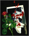
untitledby J-MeComment by littlegett: I enjoy the idea/concept here, however for me the elements that distract include:
Over smoothing,
Missing tip of the knife
Unrealistic blood
blown out whites
For some reason the blood looks like it is in globs, for me it doesn't look like a splatter, but maybe something that was added in post. The tip of the knife is what makes a good knife. If your idea was to have it in the picture, I would suggest making deep gashes in the picture, as it is now, the tip is missing.
I think images like these, darker, scream to be gritty, grudgey, dark, the smoothness just really makes everything seem flat and staged. |
| 07/27/2007 04:47:59 AM |
untitledby J-MeComment by jdannels: Its an interesting photo and in a photo like this its all in the details. For me I assume the photo was a gift, but the photo seems pretty formal and more of a headshot which makes me think maybe the the person on the other end got sick of their vanity. To me the blood seem to placed, if they had stabbed the person there wold be more than just a few drops and splatters on the end of the knife. For a set up like this I like to see it over the top. The lighting you used is really well done and the shadows are really soft and I like that there is no glare on the photo. |
| Photographer found comment helpful. |
| 07/26/2007 05:02:58 PM |
|
| Photographer found comment helpful. |
| 07/25/2007 11:09:31 PM |
Please Don't Leave Meby J-MeComment by colorcarnival: I'm surprised that this finished below 5. And it definitely does not deserve the 1's, 2's and 3's. I love the expression and that she is looking to the side. As if keeping an eye on something. Beautiful earthy color tones in the pic. Sweet face!
Oh and as far as shooting for above 6.0, 68 people agreed. You get an 11+ from me hehe. |
| 07/25/2007 12:37:26 PM |
untitledby J-MeComment by Chucker: A sad (or macabre--depending on ones viewpoint)situation beautifully executed (no pun intended)in this shot. There's a face, but he's not the subject of the extreme emotion! |
| Photographer found comment helpful. |
| 07/25/2007 12:44:28 AM |
|
| 07/25/2007 12:41:26 AM |
|
| 07/24/2007 11:59:54 AM |
|
| Photographer found comment helpful. |
| 07/24/2007 09:39:07 AM |
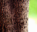
Rhythm In Nature's Patternsby J-MeComment by violinist123: I imagine you are taking a beating on this one. Tree bark could work for this challenge. Perhaps losing the blownout portion on the right of the shot would better focus attention on the patterns in your subject. Also, the subject itself needs to be in good focus without a heavy reliance on unsharp. Further, I think you could really increase the impact (and thus the 'wow' factor) by presenting this in black and white. It might make the most out of the paterns/rhythm in the bark by highlighting the contrasts of light and shapes contained within. |
| Photographer found comment helpful. |
Home -
Challenges -
Community -
League -
Photos -
Cameras -
Lenses -
Learn -
Help -
Terms of Use -
Privacy -
Top ^
DPChallenge, and website content and design, Copyright © 2001-2026 Challenging Technologies, LLC.
All digital photo copyrights belong to the photographers and may not be used without permission.
Current Server Time: 05/07/2026 04:14:39 PM EDT.