| Image |
Comment |
| 01/16/2004 08:10:57 PM |
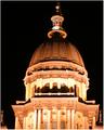
Capitolby rickhd13Comment by dsidwell: A capitol idea for a shot! It is almost symmetrical; you may consider tightening that up just a bit. I like your night lighting here. |
 Photographer found comment helpful. Photographer found comment helpful. |
| 01/12/2004 02:57:08 PM |
|
| Photographer found comment helpful. |
| 01/12/2004 12:55:06 PM |
|
| Photographer found comment helpful. |
| 01/12/2004 12:42:56 PM |
Capitolby rickhd13Comment by justine: Maybe it's me, but this looks like it's listing to the right a bit..?? Beautiful building and nice lights. |
| Photographer found comment helpful. |
| 01/12/2004 09:25:17 AM |
|
| Photographer found comment helpful. |
| 01/03/2004 08:13:40 PM |
|
| Photographer found comment helpful. |
| 01/03/2004 02:56:09 AM |
|
| Photographer found comment helpful. |
| 01/03/2004 12:10:21 AM |
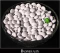
Individualityby rickhd13Comment by RonB: Nice interpretation; great expression of the catchword. I don't care much for the font that was selected, as it takes focus off the candy, and I think that the overall effect might be improved if the thin white frame was left out - just let the black have control to give even more accent to the white M&M's. |
| Photographer found comment helpful. |
| 01/02/2004 11:01:08 AM |
Individualityby rickhd13Comment by dr rick: Creative! The lighting works surprisingly well; generally double shadows should be avoided, but here it adds to the overall confusion and anonymity of the white candies. The overall poster seems a bit crowded; either remove the white border or put space around it. The aliasing in the font may be part of its individuality, but I find it distracting. |
| Photographer found comment helpful. |
| 01/01/2004 06:00:42 PM |
|
Home -
Challenges -
Community -
League -
Photos -
Cameras -
Lenses -
Learn -
Help -
Terms of Use -
Privacy -
Top ^
DPChallenge, and website content and design, Copyright © 2001-2026 Challenging Technologies, LLC.
All digital photo copyrights belong to the photographers and may not be used without permission.
Current Server Time: 07/18/2026 04:18:09 PM EDT.