| Image |
Comment |
| 11/10/2008 12:55:18 PM |
|
| 11/06/2008 03:43:23 PM |
Ephemeralby LovinlifesmComment by MistyMucky: It's a very good picture. The only drawback is that I remember that the one from kiwiness is even better |
| 11/05/2008 10:51:47 PM |
|
| 11/05/2008 03:22:52 PM |
|
| 11/05/2008 10:56:35 AM |
|
| 11/05/2008 02:41:30 AM |
|
| 11/05/2008 12:51:32 AM |
Ephemeralby LovinlifesmComment by Shutter-For-Hire: good idea, but it looks like you just flicked teh switch for the bulb on and took the pic... you gotta flick it on and off VERY quickly and time yous shot exactly for that fraction of a second that the switch is on... then our element won't be so overexposed, otherwise nice shot |
| 07/15/2008 11:55:27 PM |
Exteriorby LovinlifesmComment by Frankie_Lv: Hi Steve,
Nice image, There are two things in this image that are nicely done. The prospective of the building & the play on the lighting are nice. What I do see here is and image thhat needed some sharpening in the horizontal & vertical lines in the building itself. If you look closely you can see a jaggeredness in these lines. Secondly the light on the building is nice as I stated before but the sky (open) has a wide range of blue mergeing with the white at the bottom right. Here I think a better color balance was called for here & would have improved the image overall.
|
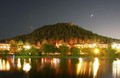
| 07/09/2008 12:38:26 AM |
Palmer Lakeby LovinlifesmComment by senor_kasper: Perhaps you should have used a graduated neutral density filter with the dark half at the bottom, that way the dwellings and street lights might have come out better exposed and not blown out. Beautiful image except for the previously mentioned. |
| 07/07/2008 11:29:48 PM |
|
Home -
Challenges -
Community -
League -
Photos -
Cameras -
Lenses -
Learn -
Help -
Terms of Use -
Privacy -
Top ^
DPChallenge, and website content and design, Copyright © 2001-2026 Challenging Technologies, LLC.
All digital photo copyrights belong to the photographers and may not be used without permission.
Current Server Time: 07/15/2026 11:54:56 AM EDT.