DPChallenge: A Digital Photography Contest You are not logged in. (log in or register
 
Browse Settings
Currently viewing:
Registered Usertcherring

Show comments:

Per page:

Order:

Comments:


Comments Received by tcherring
Pages:   ...
Showing 21 - 30 of ~289
Image Comment
Lullaby
09/24/2003 10:11:56 AM
Lullaby
by tcherring

Comment by GrandmaEMT:
I love the picture and all the cream colors. My suggestion would be to crop the picture to right above the chair. That way you still get the sensation of the sun and the shadows without all the glare.
Photographer found comment helpful.
Lullaby
09/24/2003 08:18:47 AM
Lullaby
by tcherring

Comment by anireno:
Wonderful shot. Very Good use of ligth. You shouldn´t have cropped the lower part.
Photographer found comment helpful.
Lullaby
09/24/2003 12:22:21 AM
Lullaby
by tcherring

Comment by rickhd13:
Challenge met, composition is good, lighting is well done, the only negative I see is the window is a bit too blown out with the light, otherwise a top notch photo
Photographer found comment helpful.
Lullaby
09/24/2003 12:11:28 AM
Lullaby
by tcherring

Comment by OneSweetSin:
Simply stunning. Love the way the light is coming over the shoulder and hitting the baby. Pulls the eye right into it.
Photographer found comment helpful.
Suds 'n Son
05/10/2003 01:37:39 AM
Suds 'n Son
by tcherring

Comment by sylandrix:
Greetings from the Critique Club!...

OVERALL... In all honesty, I don't think this type of mulit-image composition is what the the theme meant... though I personally believe the competition should have been titled "diptych/triptych". But they didn't and so its understandable if some strayed from that format. In this case, if I was scoring, I would not count it against the photo, but I would surmise it affected your score regardless...

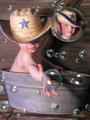
COMPOSITION....I'm not that big of a fan of the filter-like bubbles. They look computer generated and appear not to belong in the scene. As for the actual background of the composite itself, its really powerful! Muted colors that complement each other, the simple and textured wooden background, the outstretched hand that makes your eye travel down the picture. The little bit of mystery with the exclusion of the face. .. and character provided by the straw hat... all of these are the strong compositional elements that exist with the background image itself.

TECHNIQUE... Background image itself is nicely in focus, well exposed, great skin tones, but I really like the color palette used... no color stands out and distracts. Albeit the fact I'm not crazy about the photoshop work, putting the face and bubbles was done very well and looks professional. I really can't explain why I'm not crazy about the modifications. Its done well, but when I see a great picture lying underneath all the extra elements, it makes me want to just look at that image itself. And adding another point of focus in the image (the front view of the baby in the bubble), breaks the strength the original composition had - one effective focal point with a path for your eye to follow.

OVERALL... PSed or not PSed, in the spirit of this challenge or not, everyone will find one more appealing than the other. Bottom line is that they're both interesting to look at, and whether talking about the photo, or the PS work put in, they were both executed very well.
Ol' Timer
05/06/2003 02:53:31 PM
Ol' Timer
by tcherring

Comment by eloise:
Lovely sepia-toning; it really does look like a vintage photo.
Photographer found comment helpful.
Ol' Timer
05/06/2003 10:27:39 AM
Ol' Timer
by tcherring

Comment by kellie:
very, very nice i really like this photo
Photographer found comment helpful.
Ol' Timer
05/06/2003 10:00:25 AM
Ol' Timer
by tcherring

Comment by tiff:
Nice work here, i like you subject and the backroud works great with the picture. I also like the sepia tone it adds a very nice oldish feeling to your work. good job.8
Photographer found comment helpful.
Ol' Timer
05/05/2003 02:32:18 PM
Ol' Timer
by tcherring

Comment by thatguy:
i like the tone that you have shot this image in, it really adds to the idea of the carts age, nice job 5
Photographer found comment helpful.
Ol' Timer
05/05/2003 12:34:17 AM
Ol' Timer
by tcherring

Comment by Olyuzi:
Nice sepia tones and I like the composition as well, althought I wish the house weren't so dead center. Nice old time feel to this photo.
Photographer found comment helpful.
Pages:   ...
Showing 21 - 30 of ~289


Home - Challenges - Community - League - Photos - Cameras - Lenses - Learn - Help - Terms of Use - Privacy - Top ^
DPChallenge, and website content and design, Copyright © 2001-2025 Challenging Technologies, LLC.
All digital photo copyrights belong to the photographers and may not be used without permission.
Current Server Time: 08/15/2025 02:23:14 PM EDT.