| Image |
Comment |
| 06/14/2003 12:50:52 PM |
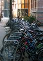
Bicycling Magazineby pedroviegasComment by HBunch: very cluttered. I think had you focussed in on one or 2 bikes, this might have had more appeal on the front of a magazine. I think your focus and clarity are ok, but too busy to really see much detail. lighting seems a bit dark, and the colors don't stand out well in this shot. definately bikes though. |
| 06/14/2003 07:43:03 AM |
|
| 06/13/2003 08:44:48 PM |
Bicycling Magazineby pedroviegasComment by inspzil: I would've gone for a lower perspective. Something more unique than just standing next to the rack taking the picture. Good subject, making it a good photo is the goal. |
| 06/13/2003 04:41:32 PM |
|
| 06/13/2003 04:01:08 PM |
|
| 06/13/2003 07:26:43 AM |
|
| 06/13/2003 01:25:17 AM |
|
| 06/12/2003 12:06:36 PM |
|
| 06/11/2003 09:50:51 PM |
|
| 06/11/2003 05:21:27 PM |
Bicycling Magazineby pedroviegasComment by RiderGal: Wow now thats a lot of bikes! Interesting, not sure if it's more a snapshot then really a professional photo for a magazine though. I like the fact you have space at the top for type, though I think getting down and filling the frame with bikes and leaving it so you could have the type over that might have been more effectual for this shot. That's just my opinion though. |
Home -
Challenges -
Community -
League -
Photos -
Cameras -
Lenses -
Learn -
Help -
Terms of Use -
Privacy -
Top ^
DPChallenge, and website content and design, Copyright © 2001-2026 Challenging Technologies, LLC.
All digital photo copyrights belong to the photographers and may not be used without permission.
Current Server Time: 07/15/2026 03:15:43 PM EDT.