| Image |
Comment |
| 01/24/2005 07:14:41 PM |
mount3.jpgby bruskiComment by Imagineer: This looks surreal! It's so lush. Where did the green hue in the sea come from - it almost looks 3D. Beautiful stuff. |
 Photographer found comment helpful. Photographer found comment helpful. |
| 01/24/2005 07:03:29 PM |
|
| Photographer found comment helpful. |
| 01/24/2005 06:20:21 PM |
|
| Photographer found comment helpful. |
| 01/08/2005 12:17:33 PM |
What Does the World Have To Offer Meby bruskiComment by Arcanist: I started this image on the low end of my rating blocks, but in reviewing it deeper find that I am intrigued by it. The blown out window is placed perfectly, the child off centered just enough and it is simple to a T. A bit of burning in the hair to remove highlights and this image would be outstanding. It does not ooze 'candid', although I am sure that it fits the challenge. I find nothing else I can comment on here. I like the image, it would draw me in for another look and I think some people other than imediate family members would find it an inteesting piece to hang on a wall either framed or as a poster. Bumping from a 3 holder to a 6.
Revisiting this one and bumping again to a 7 |
| Photographer found comment helpful. |
| 01/07/2005 08:48:57 PM |
|
| Photographer found comment helpful. |
| 01/07/2005 04:42:37 PM |
|
| Photographer found comment helpful. |
| 01/06/2005 08:46:57 PM |
|
| Photographer found comment helpful. |
| 01/06/2005 10:04:00 AM |
|
| Photographer found comment helpful. |
| 01/06/2005 07:22:43 AM |
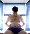
Time to lose the Gutby bruskiComment by dsb_mac: i forget the fellow's name but this photo reminds me a little of a portait done of Bill Clinton with a blue background. the photo shows someone embracing their belly which along with their downward gaze creates the connection to being over weight. the lighting suggests a positive outlook completing a connecting to the challenge theme. I think you mostly lose out on technical merit. The arms are blown out and make them look odd. there are purple tinges on the belly and the background doesn't seem quite right. |
| Photographer found comment helpful. |
| 01/06/2005 04:20:30 AM |
Time to lose the Gutby bruskiComment by SDW: A good natural shot that depicts a new years resolution for millions. However the bright light behind take away from your picture. It distorts the arms and torso. The purple hue around the hands is very distracting and your composition leads my eyes off the bottom of the picture instead of locking them on your midsection where the subject is looking. I think if this picture would of been taken from a different POV it would of been better. I'm not a fan of blowout highlights and that takes up the majority of the picture. Good luck in the challenge. |
| Photographer found comment helpful. |
Home -
Challenges -
Community -
League -
Photos -
Cameras -
Lenses -
Learn -
Help -
Terms of Use -
Privacy -
Top ^
DPChallenge, and website content and design, Copyright © 2001-2026 Challenging Technologies, LLC.
All digital photo copyrights belong to the photographers and may not be used without permission.
Current Server Time: 06/08/2026 06:10:41 PM EDT.