| Image |
Comment |
| 05/04/2007 07:47:41 PM |
Almost Symmetryby mistchild2008Comment by corinne: Next time iron the red side! :-) What's with the branch? Did a tree fall down and land on the table? The two unrelated items are depicting symmetry. I like the concept - but perhaps if you used two items that were related, it may be more pleasing to the eye. |
 Photographer found comment helpful. Photographer found comment helpful. |
| 05/04/2007 08:42:40 AM |
Almost Symmetryby mistchild2008Comment by Bruce_the_Robert: I really like this image. It is visually interesting, with some really neat effects from the glass and the shadows, and nice textures throughout. It is well shot (exposure, sharpness, etc.) to bring it together. It's a bit different, so I hope you're not getting low marks, but I really do like it. |
| Photographer found comment helpful. |
| 05/04/2007 01:42:02 AM |
Almost Symmetryby mistchild2008Comment by RPvanderHilst: I do like the addition of the branch. I find the green I see everywhere very annoying (was the 'floor' green? You can even see it in the center of the wine glass. -6- |
| Photographer found comment helpful. |
| 05/03/2007 04:24:34 PM |
|
| 05/03/2007 04:50:28 AM |
|
| 05/02/2007 04:50:25 AM |
|
| Photographer found comment helpful. |
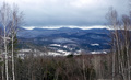
| 05/01/2007 12:00:05 AM |
The not-so-green-yet Mountainsby mistchild2008Comment by geoffb: Hi from the CC,
Your intentions were good with this image. Unfortunately, it's simply not an exciting shot, which explains the low score of this submission. The technical aspects of the photo are good: well framed by the trees and the whites are white. I like the reddish hues in some of the trees.
My first question when I saw this picture was "what's the subject?" The mountains are out of focus, have low local contrast, and don't have sufficient colour to make them "pop out". You said you did auto contrast and levels, but more could have been done. See how flat those trees on the mountain look? They could really stand out against that snow. Also, even though I said the trees frame the shot nicely, it is quite predictable. I'm betting that the sky looked more ominous when you first framed this shot; the foreboding could have been restored with some dodging and burning.
When you've got a shot with flat colour, always consider using black and white. I think a high contrast B&W shot would have scored much better here.
Regards,
Geoff Ball |
| Photographer found comment helpful. |
| 04/22/2007 01:38:45 AM |
|
| 04/10/2007 04:58:10 PM |
|
| 04/09/2007 03:08:51 AM |
|
Home -
Challenges -
Community -
League -
Photos -
Cameras -
Lenses -
Learn -
Help -
Terms of Use -
Privacy -
Top ^
DPChallenge, and website content and design, Copyright © 2001-2026 Challenging Technologies, LLC.
All digital photo copyrights belong to the photographers and may not be used without permission.
Current Server Time: 07/17/2026 02:13:38 AM EDT.