| Image |
Comment |
| 12/15/2006 02:41:06 PM |
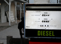
$1.32 a Gallonby chelsearocksComment by lambie83: Wow, I'm impressed. Very simple and effective. The detail and clarity are good on the gas pump in the foreground, and the background is also interesting. Cropping the side off the gas pump is not what I would have done, but you took a risk and it looks good! |
 Photographer found comment helpful. Photographer found comment helpful. |
| 12/14/2006 10:48:53 AM |
$1.32 a Gallonby chelsearocksComment by cogerox: My only improvement would be to dodge the gas handle just a little to bring out some detail. Otherwise I like this a lot. |
| Photographer found comment helpful. |
| 12/13/2006 10:12:13 PM |
$1.32 a Gallonby chelsearocksComment by glad2badad: This is a unique entry. I'd have been tempted to go straight B/W with this as there isn't much color to begin with. Little vignetting (burn in the corners), and some detailed dodging on the 1 3 2 ($1.32) numbers would help show them better. Just a thought. :D Good luck in the challenge. |
| Photographer found comment helpful. |
| 12/12/2006 07:10:17 PM |
|
| 12/12/2006 10:43:31 AM |
|
| 12/06/2006 06:51:36 PM |
|
| 12/06/2006 10:14:53 AM |
|
| 12/05/2006 08:12:34 AM |
Bridge Trustsby chelsearocksComment by Mambe: No real interest in this photo ,I know it's only basic editing but rust can look very appealing , here we can't even feel the texture and colors are a bit fade.You could have played with contrast and saturation to center the attention on the object.
Please keep in mind that this is only my opinion and my goal is to try to help. |
| 12/01/2006 12:12:33 PM |
|
| 12/01/2006 11:40:27 AM |
|
Home -
Challenges -
Community -
League -
Photos -
Cameras -
Lenses -
Learn -
Help -
Terms of Use -
Privacy -
Top ^
DPChallenge, and website content and design, Copyright © 2001-2026 Challenging Technologies, LLC.
All digital photo copyrights belong to the photographers and may not be used without permission.
Current Server Time: 07/15/2026 03:16:47 PM EDT.