| Image |
Comment |
| 05/06/2007 12:15:22 PM |
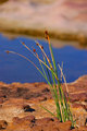
flower2.jpgby dewdodesignComment by downtherabbithole: hmm this is an iteresting picture. I think that focus is an issue though. The color harmony is nice though with the green and the blue and the dof is nice I just wish your main subject would be crisp. |
 Photographer found comment helpful. Photographer found comment helpful. |
| 05/06/2007 12:10:59 PM |
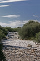
path.jpgby dewdodesignComment by alexjack: I agree w/ Melanie on her comments. The other thing I'd add is the postioning of the horizon line in mid-piture is very static and tends to leave the viewer saying "is this aout the sky or the land, sky or land??" I'd crop either up or down to have 1/3 sky and 2/3 ground for example.
Jack |
| Photographer found comment helpful. |
| 05/06/2007 12:07:22 PM |
flower2.jpgby dewdodesignComment by alexjack: Agree, nice image, very nice colors, nice mix of very warm colors. I'd consider cropping down to just above the plant, you get rid of a lot of distracting bright areas that don't add anything to your main subject.
Jack |
| Photographer found comment helpful. |
| 05/06/2007 08:46:53 AM |
path.jpgby dewdodesignComment by kteach: This shot isn't as exciting for me. The composition just doesn't draw me in as much. I like the line of the path, but something about the sky taking up that top half, and the bird sitting in an odd spot just makes this one feel more awkward. The colors aren't as vibrant as the other shot you posted either. Even a simple adjustment like duplicating the background layer and setting the mode to 'soft light', then adjusting the opacity to something you're happy with might help this one pop more. Hope that's helpful. |
| Photographer found comment helpful. |
| 05/06/2007 08:40:33 AM |
flower2.jpgby dewdodesignComment by kteach: I agree.. nice color and dof, and too bad about the cut off flower at the bottom. I like the way the brown parts of the flower stems are placed in front of the blues so they don't blend in. Good job aligning the angle before shooting. |
| Photographer found comment helpful. |
| 05/06/2007 08:33:46 AM |
flower2.jpgby dewdodesignComment by imagesbytlp: This has great color and DOF. I wish that the one strand of grass wasn't cut off. Also, that dark rock on the upper left corner is a tad distracting. Overall, a pleasing image. |
| Photographer found comment helpful. |
| 05/03/2007 07:58:50 PM |
|
| 05/02/2007 07:04:09 PM |
|
| Photographer found comment helpful. |
| 05/02/2007 12:34:49 PM |
|
| Photographer found comment helpful. |
| 05/01/2007 03:18:07 PM |
|
Home -
Challenges -
Community -
League -
Photos -
Cameras -
Lenses -
Learn -
Help -
Terms of Use -
Privacy -
Top ^
DPChallenge, and website content and design, Copyright © 2001-2026 Challenging Technologies, LLC.
All digital photo copyrights belong to the photographers and may not be used without permission.
Current Server Time: 07/16/2026 06:04:55 AM EDT.