| Image |
Comment |
| 03/05/2007 11:38:09 AM |
|
 Photographer found comment helpful. Photographer found comment helpful. |
| 03/05/2007 09:40:27 AM |
|
| Photographer found comment helpful. |
| 03/05/2007 06:52:11 AM |
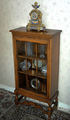
Mum's old Glass Cabinet, and Clockby GrandadComment by raish: Nice piece of furniture, evenly lit with the content well visible. All that at the cost of clearer definition to set the item off against its background. Caters for the dowdy. |
| Photographer found comment helpful. |
| 03/05/2007 12:53:38 AM |
|
| Photographer found comment helpful. |
| 03/04/2007 01:59:54 PM |
The Listenerby GrandadComment by TheStick: Not a bad image, but seems a little "snap shot-ish". It lacks the "wow" factor many look for in a free study challenge, IMHO. |
| Photographer found comment helpful. |
| 03/03/2007 01:36:43 PM |
Market Dayby GrandadComment by cryingdragon: Greets from the Critique Club
I like this shot. It has emotion in it. I can feel myself walking up the street and meeting this couple.
I agree that the crop is a bit tight on the left hand side. The bag is cut off a little. The crop makes feel a bit crowded. I like how it's cropped off at the bottom, with the wheel and the foot being cut off, that shows the movement of the people in that direction.
The desaturation works really well for this, as it does most street shots. The whites seem a little blown out, especially the top of the hat, the sky and the building behind them. So much as the top of the hat blends into the sky with no distinction between them.
Hope this helps. Feel free to send me a PM if you have any questions or comments to this. And, as always, if it's helpful, please mark the check box.
--Mike |
| Photographer found comment helpful. |
| 03/01/2007 08:31:37 PM |
The Listenerby GrandadComment by aahutch1: This appears to be a good shot in the making. I think it would benefit from a lower (and perhaps further) perspective. |
| Photographer found comment helpful. |
| 03/01/2007 02:06:29 AM |
|
| Photographer found comment helpful. |
| 02/28/2007 08:43:06 PM |
|
| Photographer found comment helpful. |
| 02/28/2007 01:43:37 PM |
Please Mumby GrandadComment by FairyWings: It's a little bit too dark for my taste. May be better with a little more light on the child's face? |
| Photographer found comment helpful. |
Home -
Challenges -
Community -
League -
Photos -
Cameras -
Lenses -
Learn -
Help -
Terms of Use -
Privacy -
Top ^
DPChallenge, and website content and design, Copyright © 2001-2026 Challenging Technologies, LLC.
All digital photo copyrights belong to the photographers and may not be used without permission.
Current Server Time: 04/02/2026 03:19:20 PM EDT.