| Image |
Comment |
| 07/24/2003 09:34:40 PM |
|
| 07/24/2003 03:36:44 AM |
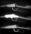
The Right to Bear Armsby kebmod54Comment by ScottK: An OK picture. The lighting is a bit of a problem. The rifles aren't aligned - the top one tilts towards you, the middle wone is sort of centered and the bottome one tilts back. This gives it a bit of a messy, unballanced feel, and causes the inconsistent lighting between the three. B&W works well, and composition is good. You had some resizing jaggies - try resizing in steps (10% at a time) - it usulally helps. "The Right To Bear Arms" seems more a principle, or maybe an institiution, than a trend. If there were a trend, it would be towards gun control - that's where the left has tried to move the country for the last several decades. The right to bear arms is established law. |
| 07/23/2003 07:08:02 PM |
The Right to Bear Armsby kebmod54Comment by miller: I like the repetiveness here. Tones are good, but the blown out middle rifle really kills the shot, so to speak. Also, the edges are really jagged, which tells me the image is oversharpened. I also hope that the right to bear arms is just a trend. But I'll keep my views on the subject out of the voting. |
| 07/23/2003 12:45:24 PM |
The Right to Bear Armsby kebmod54Comment by e301: I can sort of see the reasoning behind the very bright reflection on the middle gun: but I don't think it works - possibly because it's too uniform on that area. Looks like you had to tilt the bottom gun a little to avoid more of it too. Overall image doesn't work for me either - maybe they're too far apart? Maybe a horizontal framing would have been more effective? Not sure. |
| 07/23/2003 11:01:29 AM |
The Right to Bear Armsby kebmod54Comment by Alpine99: I prefer to arm bears!, Sorry couldn't resist. I like this moody shot. The middle rifle has picked up too much light and stands out of the image too far |
| 07/23/2003 09:56:46 AM |
The Right to Bear Armsby kebmod54Comment by vtruan: Hopefully a continued right, not even considered a trend. The flash may have made the center rifle a bit bright and somewhat distracting. |
| 07/23/2003 02:55:36 AM |
|
| 07/23/2003 02:24:51 AM |
|
| 07/22/2003 11:03:19 PM |
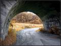
Around the Bendby kebmod54Comment by miller: Until I saw the note I was going to give you a 1 because this was obviously not taken within the challenge period. Now I'll give it a 1 because I\'m convinced you edited the EXIF data. Surely you could have found something round during the challenge?! just kidding... come on... people need to find something better to do with their time.
Composition is good. But I think that because there\'s no overwhelming color, it might be a good candidate for black and white or possibly sepia. It would really bring out the texture in the road and the walls. |
| 07/22/2003 11:38:37 AM |
|
 Photographer found comment helpful. Photographer found comment helpful. |
Home -
Challenges -
Community -
League -
Photos -
Cameras -
Lenses -
Learn -
Help -
Terms of Use -
Privacy -
Top ^
DPChallenge, and website content and design, Copyright © 2001-2026 Challenging Technologies, LLC.
All digital photo copyrights belong to the photographers and may not be used without permission.
Current Server Time: 07/16/2026 11:09:01 PM EDT.