| Image |
Comment |
| 08/18/2007 06:49:29 AM |
|
 Photographer found comment helpful. Photographer found comment helpful. |
| 08/17/2007 08:51:42 PM |
|
| Photographer found comment helpful. |
| 08/17/2007 06:20:56 PM |
|
| Photographer found comment helpful. |
| 08/17/2007 04:30:01 PM |
|
| Photographer found comment helpful. |
| 08/17/2007 12:46:36 PM |
|
| Photographer found comment helpful. |
| 08/16/2007 11:16:51 PM |
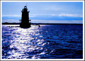
Providence is merely a bridge awayby bassboneComment by neophyte: I like the idea you had to frame the skyline with the bridge. Perhaps framinging it completely within the bridge would've given this photo more of a "finished" feel. Everything considered, it's a really nice photo that has great tonal range.... (IMO) |
| Photographer found comment helpful. |
| 08/16/2007 06:19:17 AM |
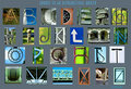
August is an Alphabetic Monthby bassboneComment by h2: very, very nice shots (except for C and U, the rotating/flipping is too obvious), but the arrangement doesn't work for me. the gaps between the pics are irregular, they don't even keep the baseline - looks like the height of the pictures differs. i had placed them in a way, that there is a equal amount of space between the edge of the poster and the pics, except for the bottom, where title and © should stand. the typeface works fine for the headline, not for the signature. color of typeface is way off, better go for white. some pics could be croped a little closer, especially the O and the I.
Hope that helps (and trust me, I'm a CD)! |
| Photographer found comment helpful. |
| 08/15/2007 09:55:35 PM |
|
| Photographer found comment helpful. |
| 08/15/2007 10:47:04 AM |
|
| Photographer found comment helpful. |
| 08/15/2007 08:19:23 AM |
|
| Photographer found comment helpful. |
Home -
Challenges -
Community -
League -
Photos -
Cameras -
Lenses -
Learn -
Help -
Terms of Use -
Privacy -
Top ^
DPChallenge, and website content and design, Copyright © 2001-2026 Challenging Technologies, LLC.
All digital photo copyrights belong to the photographers and may not be used without permission.
Current Server Time: 07/18/2026 06:46:36 AM EDT.