| Image |
Comment |
| 11/05/2004 11:38:51 PM |
|
 Photographer found comment helpful. Photographer found comment helpful. |
| 11/04/2004 06:35:58 PM |
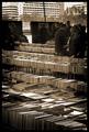
Browsingby PaulMdxComment by bpickard: You have the lovely pattern of the books but i think the building in the background detracts: how about cropping above the browsers' heads? Good eye though. |
| Photographer found comment helpful. |
| 11/04/2004 04:34:20 AM |
Browsingby PaulMdxComment by terje: This is too under exposed, and burned out in the sides/top, I want more detail. I like the BW conversion though you may have added a litle too much contrast, or simply had a poor exposure. 4 |
| Photographer found comment helpful. |
| 11/03/2004 02:37:23 PM |
|
| Photographer found comment helpful. |
| 11/03/2004 12:21:07 PM |
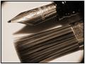
To ink ... Or paint?by PaulMdxComment by Kavey: My favourite entry in this challenge. I love the detail in the textures of both metal and brush hairs. Toned black and white looks great. Only minor minus point is the doobries at the top left and bottom right corners. Is that from a hood or just a regular zoom? |
| Photographer found comment helpful. |
| 11/02/2004 02:40:18 PM |
Browsingby PaulMdxComment by lizzyc3: Loving the patterns, feels a little unbalanced because there's no people on the bottom and a lot on the top but thats not a big deal- great job! 8 |
| Photographer found comment helpful. |
| 11/01/2004 05:03:51 PM |
Browsingby PaulMdxComment by Philos: The problem for me with this photo is that there is not one point where my eyes are atracted to.
It's to busy for my taste. |
| Photographer found comment helpful. |
| 10/21/2004 05:38:29 AM |
Shellysby PaulMdxComment by redmoon: i'm quite surprised i like this - maybe it's partly to do with civic pride (its london innit), but i strongly suspect it's how you've made something seemingly dull look quite arty. the angle certainly helps - but its also the strength in the colours of the sigh compared to its surroundings. everything feels so bustly around it... it's in the same vein as those posters of starbucks you see in starbucks... not entirely sure about having white for the border (what would have been really clever would be to copy the sign, you know, black with a thin blue line), but that aside, this is a strong image that suggests to me the photographer had quite a bit of thought. very excellent. 9. |
| Photographer found comment helpful. |
| 10/18/2004 10:01:41 PM |
|
| Photographer found comment helpful. |
| 09/28/2004 03:37:20 PM |
|
| Photographer found comment helpful. |
Home -
Challenges -
Community -
League -
Photos -
Cameras -
Lenses -
Learn -
Help -
Terms of Use -
Privacy -
Top ^
DPChallenge, and website content and design, Copyright © 2001-2026 Challenging Technologies, LLC.
All digital photo copyrights belong to the photographers and may not be used without permission.
Current Server Time: 07/17/2026 02:24:15 AM EDT.