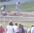
DPChallenge: A Digital Photography Contest You are not logged in. (log in or register
 
Browse Settings
Currently viewing:
Memberwhiterook

Show comments:

Per page:

Order:

Comments:


Comments Received by whiterook
Pages:   ... [343] [344] [345] [346] [347] [348] [349] ... [383]
Showing 3451 - 3460 of ~3828
Image Comment
future hall of famer?
01/26/2007 08:30:56 AM
future hall of famer?
by whiterook

Comment by mbardeen:
Hi,
I'm going to offer a critique, though you will probably ignore it. There are certain things you should do whenever you prepare a shot to submit to DPChallenge.

First ask yourself "What is the subject of this shot?"
Is it the grass? Is it the chain link fence? Is it the crowd? Is it the ball player. I can't tell. Remember - Simple is good. Too many distractions and the eye wanders. If something is in the photo and it is not the subject, crop it out.

Second: Colours - for a start. Black should be Black. White should be white. Here your black is a form of gray -- that is what people mean when they say "too washed out". Adjusting the contrast (or levels) of this photograph would do a lot to help.

I've taken the liberty of cropping your photo and adjusting the colours so you can see the difference this makes - I hope you are not offended.


Third: Composition - Your ball player is performing some action and your photograph should be telling a story about that action. If I look at this photo, I immediately think that he has struck out. Why? Because you have included the catcher, so I think he's important to the story. But then when I look, I do not see any ball in his hand and I become confused. If you had included more out in front of the ball player and crop out the catcher completely, I suddenly understand he's hit the ball and then the context becomes clear. Now your photo stands alone and tells a story in its own right -- your title only helps to reinforce your photo.

Witness this quick and dirty edit:


Ideally there would be even more space out in front of the player, but this should at least help you see the difference.

I hope this helps,
-Matt
Photographer found comment helpful.
Chess Match with timing
01/26/2007 08:23:36 AM
Chess Match with timing
by whiterook

Comment by Retroesque:
Not minimal at all!
Photographer found comment helpful.
Chess Match with timing
01/26/2007 08:21:56 AM
Chess Match with timing
by whiterook

Comment by bood:
This is ABSOLUTELY DREADFUL rook
well done (in advance)for your last place!
a 1 from me
Photographer found comment helpful.
Chess Match with timing
01/26/2007 08:01:57 AM
Chess Match with timing
by whiterook

Comment by vtruan:
"only occupying a very small portion of the image space"
Photographer found comment helpful.
future hall of famer?
01/26/2007 07:36:52 AM
future hall of famer?
by whiterook

Comment by w24x192:
Wow...I didn't expect this to ribbon on either side of the scale. Still, there is no acounting for taste. Here's to your getting a primary-colored ribbon in 2007.
Photographer found comment helpful.
Chess Match with timing
01/26/2007 06:35:44 AM
Chess Match with timing
by whiterook

Comment by Hipychik:
The players must have fell out of their chairs!
Photographer found comment helpful.
future hall of famer?
01/26/2007 05:13:54 AM
future hall of famer?
by whiterook

Comment by whiterook:
Why do 44 people think this shot is terrible?
The chain link fence is sharp.
The grass is green.
I don't really see this shot is washout!
Thank for another brown ribbon. Guess I am a point guard for this group!


Message edited by author 2007-01-26 05:16:16.
buddy
01/26/2007 03:03:28 AM
buddy
by whiterook

Comment by SuperTimmy:
You may have noticed that almost the entire face of your subject is hidden by bars and the like. My suggestion in future situations, place a small mirror in the photo to permit viewing of the subject.

The date stamp, while informative, does not add to the artistic quality of the photo. My suggestion, provide a calender or other date/time indicating device in the background of the photo if this information is crucial.

On a positive note, your subject seems to have a good attitude.
Photographer found comment helpful.
Million dollars view
01/26/2007 02:57:51 AM
Million dollars view
by whiterook

Comment by SuperTimmy:
I like how the photo is not level. Excellent post processing with the text added to the photo. Only suggestion, use brown text instead of blue to "match" the color of the grass in the foreground.
Photographer found comment helpful.
Chess Match with timing
01/26/2007 02:56:50 AM
Chess Match with timing
by whiterook

Comment by kevip6:
This looks like a tough shot to work out the exposure for due to the strong light through the door. It's lacking a bit of contrast at the forground and the door is blown out at the back. Try reducing the exposure and see if this helps?
Photographer found comment helpful.
Pages:   ... [343] [344] [345] [346] [347] [348] [349] ... [383]
Showing 3451 - 3460 of ~3828


Home - Challenges - Community - League - Photos - Cameras - Lenses - Learn - Help - Terms of Use - Privacy - Top ^
DPChallenge, and website content and design, Copyright © 2001-2025 Challenging Technologies, LLC.
All digital photo copyrights belong to the photographers and may not be used without permission.
Current Server Time: 09/26/2025 08:05:08 PM EDT.