| Image |
Comment |
| 05/20/2007 12:12:31 AM |
Summer Fogby whiterookComment by ltlmschrisss: I am sure that this has been mentioned. If you read the challenge discription it explains the vanishing point definition. Aside from that the horizon is really skewed, and there is really no pop to the photo. I am also not able to really see what the main subject (other than fog) is supposed to be. |
 Photographer found comment helpful. Photographer found comment helpful. |
| 05/19/2007 08:32:56 AM |
|
| Photographer found comment helpful. |
| 05/19/2007 02:12:30 AM |
Summer Fogby whiterookComment by mpeters: Not sure about the grain. The pastel colors are nice but i'd like to see the green desaturated to match. |
| Photographer found comment helpful. |
| 05/17/2007 07:14:46 PM |
Summer Fogby whiterookComment by boyd2000: DNMC...after seeing complaints in the forum I'll elaborate. I see no converging lines. Is this whiterook? See the definition of Vanishing Point in the challenge. It's not fading into the fog. Maybe you considered the fence to be it, but it's far too far away and vague for me. |
| Photographer found comment helpful. |
| 05/16/2007 10:46:43 PM |
|
| Photographer found comment helpful. |
| 05/16/2007 09:29:27 PM |
|
| Photographer found comment helpful. |
| 05/16/2007 09:08:34 PM |
|
| Photographer found comment helpful. |
| 05/16/2007 04:42:21 PM |
Summer Fogby whiterookComment by mileskea: dnmc how can this be a vanishing point? Apart from the foreground bush it is difficult to make out anything else.
The challenge was quite specific in what was required and this shot - in my opinion - didn't hit the mark. |
| Photographer found comment helpful. |
| 05/16/2007 11:14:27 AM |
|
| Photographer found comment helpful. |
| 05/16/2007 09:35:08 AM |
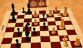
Two Knights Defense (56) -White to Moveby whiterookComment by KaDi: Greetings from the Critique Club!
Interesting looking game set up. I can understand the idea of chess as a sport...but the other part of the challenge was to show the action. I think including some human interaction with the pieces would help immensely in that regard. Perhaps showing a hand poised over one of the white pieces as if deciding to make the move?
The lighting is very yellow and unflattering in this image. I think using the camera's white balance compensation or fixing it in post-processing would help. The direction of the lighting (coming from almost directly over head) shortens the shadows and makes it hard to see the detail in the black pieces...the two bishops, for example, almost look like one object. At the same time the tops of the white pieces are too light...for example, compare the tops of the two nearest white pawns with the pawns guarding the king.
Subject is just one element of a photograph but lighting is everything!
Keep shooting what you love.
Regards, Kadi |
| Photographer found comment helpful. |
Home -
Challenges -
Community -
League -
Photos -
Cameras -
Lenses -
Learn -
Help -
Terms of Use -
Privacy -
Top ^
DPChallenge, and website content and design, Copyright © 2001-2026 Challenging Technologies, LLC.
All digital photo copyrights belong to the photographers and may not be used without permission.
Current Server Time: 06/24/2026 12:21:58 AM EDT.