| Image |
Comment |
| 04/13/2005 12:05:40 PM |
|
 Photographer found comment helpful. Photographer found comment helpful. |
| 04/13/2005 08:15:08 AM |
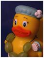
Bath With A Snackby ShannonComment by rex: *Critique Club*
Intial Impact: I think it is ok. You could have benefitted from a little more post processing.
Sharpness: The focus and dof is very nice here. Everything appears to be in good focus including the water drops on the beak and brush.
Composition: I think you could have improved this had you not got so close to the duck. I see in your edits that you didn't crop it so maybe back up just a little and get more of the duck.
Overall: Like I said above I think it is a little too tight. Also the grapes could have used a little bump in color to make the green stand out a little more. I normally don't like borders too much but in this photo it works and doesn't take away from your photo. I think the border actually helps it. Also it seems a little underexposed could be your lights. Maybe more lights or use your flash. The background is very dark also and could use more light. I would suggest one light for the background and one light for each side of the duck. I would like to see more light on the back side of the duck in the right of the picture.
Good luck in all future challenges. |
| 04/13/2005 03:13:26 AM |
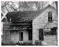
Nobody Lives Here.......I Hopeby ShannonComment by BK26: I love it. The value, contrast, textures, lines, and everything. Nice composition. The lighting is a bit bright in the upper left area but that's about the only bad part. |
| Photographer found comment helpful. |
| 04/12/2005 11:15:33 PM |
|
| Photographer found comment helpful. |
| 04/12/2005 06:50:08 PM |
|
| Photographer found comment helpful. |
| 04/11/2005 11:09:10 AM |
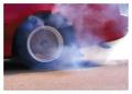
Burnoutby ShannonComment by ty_roni: Better lighting would have been good and more thought on composition, nice idea though 6... |
| Photographer found comment helpful. |
| 04/11/2005 06:21:53 AM |
|
| Photographer found comment helpful. |
| 04/11/2005 03:08:15 AM |
Donovanby ShannonComment by kiwinick: I gave you a 7 for this shot,the eyes are the heart of this shot,You have detail in the catso exposure is ok, I would agee with others that the white background has given him a cut out feel and this perhaps is what the voters thought. Message edited by author 2005-04-11 03:12:37. |
| 04/11/2005 02:54:55 AM |
Donovanby ShannonComment by RulerZigzag: Hello, I gave you a six and made a comment below also. I think lighting was your only problem |
| 04/11/2005 12:45:46 AM |
Donovanby ShannonComment by Art Roflmao: Needs some kind of different lighting to show the cat's facial features a little better. Hard to make out. Hope that's helpful. |
Home -
Challenges -
Community -
League -
Photos -
Cameras -
Lenses -
Learn -
Help -
Terms of Use -
Privacy -
Top ^
DPChallenge, and website content and design, Copyright © 2001-2026 Challenging Technologies, LLC.
All digital photo copyrights belong to the photographers and may not be used without permission.
Current Server Time: 07/27/2026 11:05:49 AM EDT.