Depotby
drydocComment by Lustre: Critique Club
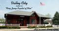
Composition: In general I really like the composition. The building is nicely placed, the flag (so important to American's it seems) is prominent, and there is a lovely piece of sky to enter the text over. I think the text in the lower right corner is hard to read and unnecessary though.
Technical Quality: The photo is fairly good from a technical standpoint. The building is a little dark from shadows though - depending on the orientation of the building perhaps shooting earlier in the morning or late afternoon would have produced less shadow. Also the text is a little soft, but this is probably a result of the image being reduced to <150kb and not your fault.
Meeting the challenge: It seems to be a nice postcard which is appropriate for "Valley City". The text in the top half is quite appropriate for a postcard.
Creativity: Presumably the depot is a landmark and a sense of pride for the community, and therefore an appropriate subject for a postcard. The shot itself isn't terribly creative, but I think it's appropriate for the mood you were seeking.
Overall: It's a good shot which struggles a bit from harsh lighting creative shadows on the main subject. Also the parallax type effect of the building becoming smaller towards the right was initially offputting but fine once I looked at the picture for a couple of minutes.