DPChallenge: A Digital Photography Contest You are not logged in. (log in or register
 
Browse Settings
Currently viewing:
Registered Userdrydoc

Show comments:

Per page:

Order:

Comments:


Comments Received by drydoc
Pages:   ... [180] [181] [182] [183] [184] [185] [186] ... [200]
Showing 1821 - 1830 of ~1996
Image Comment
Serve God and Milk
06/27/2003 09:16:28 AM
Serve God and Milk
by drydoc

Comment by JPR:
I do neither but the prospect is quite funny.
Serve God and Milk
06/26/2003 11:14:55 AM
Serve God and Milk
by drydoc

Comment by Martin:
Who's god? Nice picture none the less. 7
Serve God and Milk
06/26/2003 01:36:22 AM
Serve God and Milk
by drydoc

Comment by ChrisW123:
It's tilted to the right. Otherwise a good shot.
Serve God and Milk
06/25/2003 08:48:31 PM
Serve God and Milk
by drydoc

Comment by casualguy:
Pretty busy.....
Serve God and Milk
06/25/2003 02:19:09 PM
Serve God and Milk
by drydoc

Comment by Crafty Sue:
This is the way I remember the country I like the way you have included more than one thing about the country, 6
Serve God and Milk
06/25/2003 11:59:58 AM
Serve God and Milk
by drydoc

Comment by pocketed:
I really like the lighting. The cows are pretty well in focus. But the trees in the background could be more focused.
Photographer found comment helpful.
Serve God and Milk
06/25/2003 08:56:44 AM
Serve God and Milk
by drydoc

Comment by orussell:
If you didn't Auto Level, it may have helped a little with the color cast / haze / slight overexposure in the BG
Photographer found comment helpful.
Serve God and Milk
06/25/2003 03:19:53 AM
Serve God and Milk
by drydoc

Comment by Dallas_TX:
just wonderful. Great title as well!
Yields Green
05/27/2003 12:46:24 AM
Yields Green
by drydoc

Comment by HBunch:
*Critique Club*
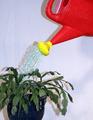
While I can see and read your explaination, I think that the red/yellow watering can is a little too brightly colored for this shot. It kind of 'steals the spotlight'. It's so much brighter than the plant that it really is a distraction for the plant.
The yellow alone might not bee SO harsh, and would still allow for your 'story' to stand true. In your explaination, I don't believe you need the red.
The lighting is not ideal here. The shadows are also a bit of a distraction in my opinion. As suggested, moving a bit away from the wall will help to reduce this shadow. Also, play with different lighting. That will helps shdows also.
The solid white background was a good choice, as there are no distracting elements in the background alone.
Focus and clarity seem ok to me. I especially like the detail in the water.
The angle and framing/cropping are OK, but maybe a little close to the plant on the left. Either crop more of the plant out, or include the entire plant. I tried a crop on the top also, and it actually doesn't look bad if you crop out ALL of the red part, and just let the yellow peek in through the top. Just my opinion though.
It's a neat idea.
~Heather~
Photographer found comment helpful.
Primary Care - "Code blue"
05/22/2003 04:33:07 PM
Primary Care - "Code blue"
by drydoc

Comment by HBunch:
*Critique Club*
I like it. I think that it would make a great ad or comercial. I do think that I would have left out the reflection of the cars on the right of the photo. Not quite sure how you could do that without simply cropping it out, or moving the entire shot over a bit.
The lighting looks good. No distracting glares on the motorcycle. No harsh shadows either. I think that you got the lighting just right, and on shiny metals, that can be most difficult.
I like the angle, it lets us see enough of the motorcycle and products to make it interesting.
Focus and clarity are really good. We can read the bottles, and see exactly what it is that you are doing to the cycle.
I think I would have left out the toothbrush. Simply on the visual appeal basis. I don't like looking at my own toothbrush, let alone other people's toothbrushes. Kind of an ettiquette thing, I guess. Most likely a product of some sort of obsessive compulsive disorder on my part. lol
I like the addition of the red stool. I think that any other color would have been too much, or make it cluttered.
Nice shot. ~Heather~
Photographer found comment helpful.
Pages:   ... [180] [181] [182] [183] [184] [185] [186] ... [200]
Showing 1821 - 1830 of ~1996


Home - Challenges - Community - League - Photos - Cameras - Lenses - Learn - Help - Terms of Use - Privacy - Top ^
DPChallenge, and website content and design, Copyright © 2001-2025 Challenging Technologies, LLC.
All digital photo copyrights belong to the photographers and may not be used without permission.
Current Server Time: 06/17/2025 04:32:55 PM EDT.