| Image |
Comment |
| 10/12/2005 07:55:25 AM |
Heart of the shipby drydocComment by Longreach: I like your interpretation of the challenge. Did you attempt to take the shot with slightly less light? I'm just thinking the 'heart' wouldn't normally be in such stark, clinical brightness (unless it was having surgery). It is a fine technical shot that, in my opinion, addresses the challenge very well. I like it. |
 Photographer found comment helpful. Photographer found comment helpful. |
| 10/09/2005 01:29:08 AM |
Shady Porch Swingby drydocComment by fstopopen: I wish I was there. I also wish you would have saturated better, not overexposed, used more contrast, and that the image was sharper in the foreground |
| Photographer found comment helpful. |
| 10/08/2005 03:52:46 PM |
|
| 10/08/2005 01:17:40 PM |
|
| 10/08/2005 11:52:37 AM |
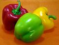
An Exercise in. . .by drydocComment by HVGB_photos: This was a difficult challenge to work on... people's opinions differ on what the "complementary colours" are, mainly depending on whether they are working with a system based on Red, Yellow and Blue as their primary colours ("subtractive colour") or a system of Red, Green and Blue ("additive colour") as their primary colours.
For this challenge, I believe either system is acceptable.
Complementary colours are pairs of "opposite" colours that contrast strongly when compared to each other. The challenge called for "two complementary colors to compose your photograph" but your photo shows yellow and orange as well as red and green, and that dilutes the effect of a single colour (green) against its opposite or complementary colour (red).
Nevertheless, this is a fantastic shot of the peppers and I think it's mouthwatering good, to boot!
I think your photo would have been a stronger demonstration of complementary colours if you had replaced the yellow pepper with another red or green one and shot against a neutral background of black, white or grey.
|
| Photographer found comment helpful. |
| 10/07/2005 11:47:51 PM |
|
| 10/07/2005 07:07:43 PM |
|
| 10/06/2005 11:03:34 PM |
An Exercise in. . .by drydocComment by KiwiShotz: The comlimentary colours challenge is about
"use TWO complementary colors to compose your photograph"
This is more than 2 colours and whilst is is a fine photo, I cannot score it any higher than 3 |
| 10/05/2005 09:14:22 PM |
|
| 10/05/2005 02:01:12 PM |
An Exercise in. . .by drydocComment by Elaine: I think for this challenge it would have been better to use the red and green peppers on a neutral background. |
Home -
Challenges -
Community -
League -
Photos -
Cameras -
Lenses -
Learn -
Help -
Terms of Use -
Privacy -
Top ^
DPChallenge, and website content and design, Copyright © 2001-2026 Challenging Technologies, LLC.
All digital photo copyrights belong to the photographers and may not be used without permission.
Current Server Time: 07/22/2026 07:43:13 AM EDT.