| Image |
Comment |
| 11/02/2005 05:18:56 PM |
Say, Yes! Pick Me!by drydocComment by talmy: Maybe, but might be a better match for this weeks subject "Garbage" :-)
I'd like to see it cropped down to just the lawn near the center of the current frame to emphasize all the signs.
|
 Photographer found comment helpful. Photographer found comment helpful. |
| 10/28/2005 11:21:24 PM |
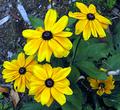
Black-eyed Susansby drydocComment by Tammer: Nice black-eyed susans. While there is grain in your background, the flowers themselves don't seem to have any. I wonder how this would look as a black and white with a bit more contrast and grain overall? |
| Photographer found comment helpful. |
| 10/28/2005 11:02:15 PM |
Black-eyed Susansby drydocComment by Yellowpeep: This is a nice photo. And it leaves me wondering whether or not the grain really enhanced the image. To me, grain works best in photos that are dark, contrasty or moody, or to provide an "aged" look. This seems to me like a good image that had grain added to it for a contest, rather than an image that was enhanced by the use of grain. Keep shooting! :) |
| Photographer found comment helpful. |
| 10/25/2005 05:34:28 PM |
myPodby drydocComment by tpoc: is the focus of the photo supposed to be the i-pod or the reflection? the title leads my eye to the i-pod... |
| 10/25/2005 02:33:17 PM |
|
| 10/25/2005 10:49:49 AM |
|
| Photographer found comment helpful. |
| 10/25/2005 01:05:49 AM |
Black-eyed Susansby drydocComment by mocabela: First of all, this shot has some good potential - the flowers are nicely in focus, and the diagonal line adds interest to the shot; where this photograph loses the viewer, however, is in the colour. The white balance is pretty significantly off - you definitely need to go warmer with this one if you're going to stay with colour; the vividness of the yellow colour against the gloom of the backdrop would be very effective if the yellow shade were corrected. Alternatively, this would look great in black and white. For this particular challenge, I'm not really seeing a lot of good grain - there is some colour noise that is more of a detriment than anything else in the greens - again, I would recommend colour correction or desaturation. In this case, the grain doesn't add to the mood, because it is not a true, all-over grain. I do like the composition/crop, however, and with a tish of sharpening this would be as clear as you could want. Colour work is really all this needs. Good luck! |
| Photographer found comment helpful. |
| 10/24/2005 09:22:53 PM |
myPodby drydocComment by mkalandros: This doesn't do much for me. The reflection and background are of a nondescript room. The only person in the shot is reading a book. The whole image is static. I don't even get the impression that the guy is listening to music. The reflected image is a bit cluttered. Maybe having the guy dancing to music would have added a dynamic element that would have tied into the iPod subject better. |
| 10/24/2005 08:30:20 AM |
|
| 10/23/2005 08:28:12 PM |
myPodby drydocComment by Tammer: I like the reflection on the TV. For me, had you cropped in tighter just around the tv itself I would have scored this higher. Nice iPod, but for me, it doesn't do much for your reflection entry. |
| Photographer found comment helpful. |
Home -
Challenges -
Community -
League -
Photos -
Cameras -
Lenses -
Learn -
Help -
Terms of Use -
Privacy -
Top ^
DPChallenge, and website content and design, Copyright © 2001-2026 Challenging Technologies, LLC.
All digital photo copyrights belong to the photographers and may not be used without permission.
Current Server Time: 07/22/2026 06:19:29 AM EDT.