Rack Reflectionby
dan_pendletonComment by HBunch: *Critique Club*
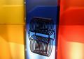
I like the black thing, and the reflection from the black thing.
The background is good, but I think that the holes in the folders(?) are a bit distracting, also, it looks like there are pockets on the folders, which create a bit of a distraction also. The reflection is nice, however, there is a lighting problem on the reflections. See how there is a glare on them? I can't see enough of the background to see if the same glare is on the background too, but it is definately on the reflection of the background.
I do wish that the yellow, blue and red all merged together, and not have those 2 dark lines on each side of the blue folder.
Maybe it would have worked better had there been a bit better focus on the folders and reflection of the folders.
Lighting on the black subject is good, and focus is also.
Actually, I like this with a vertical crop showing only the blue folder, blue reflectin and black object with reflection. This was interesting to me.
Overall, definately fits the office art category, and is appealing to look at.
~Heather~