| Image |
Comment |
| 03/19/2007 07:10:12 PM |
|
 Photographer found comment helpful. Photographer found comment helpful. |
| 03/19/2007 02:43:09 PM |
|
| Photographer found comment helpful. |
| 03/19/2007 02:17:49 PM |
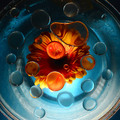
Bubbles and Blossomsby CitadelComment by Artifacts: Positives:
Unique twist on the challenge theme. Interesting concept and generally pulled off well. Good combination of warm and cool colors.
Technicals:
Overal good. Exposure and lighting generally good. Sharpness and DOF is fine though some of the bubbles look a little soft despite taken at f/22. That might have been caused by motion.
Looks to be slightly oversharpened. There are a few digital effects that show up as a result.
The challenge:
Your unique approach helps it fit the challenge in ways acceptible to DPC voters.
Suggestions:
By far, the thing that most affects this image reducing its score, inmho, is the crop. Looks like you were careful to include all the drops you worked so hard to create. You don't need to. In fact, it will make a better composition if you do not. You might consider cropping closer to remove any signs of the rounded edges of the bowl. Though, yes, it adds more 'roundness' to the composition for the challenge, removing it would make a much better overall composition. Try it to see for yourself. |
| Photographer found comment helpful. |
| 03/19/2007 01:25:29 PM |
|
| Photographer found comment helpful. |
| 03/19/2007 11:55:39 AM |
Bubbles and Blossomsby CitadelComment by pamelasue: I gave this a 6 ... I thought that the colors worked really well together, but I agree with the previous comments that the lighting is a bit harsh on the petals and the center is a bit dark ... I also would like to see the drops be a bit smaller to give it more distortion/magnification ... |
| Photographer found comment helpful. |
| 03/19/2007 11:44:59 AM |
Bubbles and Blossomsby CitadelComment by OdysseyF22: I think much of the problem here lies in the lighting. For starters, it has a harsh spread from the blown petal tips to the dark, black upper corners. Furthermore, this lighting gives the water drops a flat, milky appearance. A second light source above the setup, coming in at an angle, perhaps almost a raking light might have given the whole thing more "pop" and removed the milky look. It would also have balanced out the light and dark areas. I do like the blue glow coming from behind. I also wonder about the size of the water drops, and if having more smaller ones might have been more effective. I say this because the ones over the blue don't really do anything except look interesting, while it's the ones over the flower that create neat distortions. My last observation is that I'm unsure about including the edges of the bowl at the corners simply because it creates reflections and color-bands that draw the eye from the center of the image. |
| Photographer found comment helpful. |
| 03/19/2007 11:33:23 AM |
Bubbles and Blossomsby CitadelComment by h2: I gave this a 6, I liked the colors. What I disliked is the dark center of the blossom and the blown lights at the lower petals tips. Your lighting simply is too harsh, a reflector behind the arrangement would have helped a lot. |
| Photographer found comment helpful. |
| 03/18/2007 11:43:42 AM |
|
| Photographer found comment helpful. |
| 03/18/2007 12:25:32 AM |
A Chair for a Bearby CitadelComment by Judi: Hi, Greetings from the Critique Club:
Composition:Now this is cute. It has so much potential. At the moment it looks very much like a stock photo. You need to break away from that for this subject. Maybe put a little flower pot with flowers and a bow on the floor next to the chair. An additional mini photo in a frame hanging in the background would look great. It would complete the story. And not be a 'stick the subject on a white background and take a picture' style shot!
Technical:This is the main area that has let you down. I have uploaded my version to show you what I mean with the backdrop. I can see what you were aiming for but it has actually let the image down. Go for a clean image....with as little detail as possible. This image needs to be clean, bright, cute and colourful. Hence the addtion of the photo frame in the background and the flowers. The greyed floor is NOT suitable for this image. Also, rid yourself of those shadows. A general rule is to have the subject a minimum of the same distance from the backdrop as it is in height. Example - 6 foot tall person should be a minimum of 6 foot from the backdrop. Now you are also photographing a still life. So why use a flash. Use a light and bounce it off some small foil covered boards if need be. Use a tripod and low ISO with a long shutterspeed. Use a narrow aperture also. Your subject is NOT going to run away...so why take a quick shot?
Overall: I think this gorgeous bear and chair needs to make another appearance...but I think the bear needs to befriend the photographer and together they work as a team. Keep up the great effort and ideas in your work...and please....don't give up.
 |
| Photographer found comment helpful. |
| 03/15/2007 02:43:16 AM |
|
| Photographer found comment helpful. |
Home -
Challenges -
Community -
League -
Photos -
Cameras -
Lenses -
Learn -
Help -
Terms of Use -
Privacy -
Top ^
DPChallenge, and website content and design, Copyright © 2001-2026 Challenging Technologies, LLC.
All digital photo copyrights belong to the photographers and may not be used without permission.
Current Server Time: 06/23/2026 02:58:44 AM EDT.