| Image |
Comment |
| 04/17/2004 08:20:47 AM |
|
 Photographer found comment helpful. Photographer found comment helpful. |
| 04/16/2004 12:07:48 AM |
|
| Photographer found comment helpful. |
| 04/15/2004 09:23:32 PM |
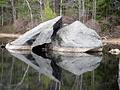
Enduranceby amsmythComment by sfalice: Oh, this (or these) rocks tell a story. Perfect for the strength category and I hope you do very, very well. 10 |
| Photographer found comment helpful. |
| 04/15/2004 01:42:07 PM |
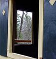
Two for Oneby amsmythComment by photom: Nice find - and the" two for one" title is catchy. To me, the overall photo lacks impact - mostly because the end view through window #2 is pretty busy and doesn't reall have a "subject." There's also some composition issue such as the "border areas:" 1) The slim area on the very top left of the frame should be eliminated, 2) The white board in the top right of the frame leads you out of the frame (And since we should probably see more of the bottom of window #1 - maybe just moving the camera down a bit would be the thing to do.). Finally - it would be helpful if there were some texture in the area inside the building. Was there a way to get some light reflected in there? I know this is a lot of info - but hope it heps. |
| Photographer found comment helpful. |
| 04/15/2004 01:30:01 PM |
|
| Photographer found comment helpful. |
| 04/14/2004 01:41:14 PM |
|
| Photographer found comment helpful. |
| 04/14/2004 01:19:32 PM |
Enduranceby amsmythComment by CDS: I like the ripple effect that you have captured in the water. Really adds depth to the photo. The rocks themselves look a little over exposed. |
| Photographer found comment helpful. |
| 04/14/2004 12:24:46 PM |
Enduranceby amsmythComment by justine: Love the title. Your colors seem a bit washed out and flat. Some contrast is needed. I think a bit off the top to pull the eye down even more. Also the right side one little rock could be cut out. Nice shot. I hope you do well, meets the challenge. |
| Photographer found comment helpful. |
| 04/14/2004 12:26:39 AM |
Enduranceby amsmythComment by md8speed: Nice idea! I would have liked it if the water was more calm so you could get a better reflection, but you don't have much control over that |
| Photographer found comment helpful. |
| 04/02/2004 07:59:01 PM |
Horticulture: Phalaenopsis - Luxury For Lessby amsmythComment by dr rick: Greetings from the Critique Club!
The message
The intent of this image is to interpret the natural beauty of this orchid. It's pure whiteness makes it a technically difficult choice, but a great subject for a magazine cover.
Creative choices
The lighting is nicely soft and at a good angle to bring out the textures and forms of the petals. The background is blurred perfectly and makes a great contrast with the flowers. I think a more frontal point of view would work better; the petals obscure interesting parts of the flowers in this nearly side view. The focus seems a bit soft; some sharpening would enhance the textures and better show off the orchids' beauty.
Technical aspects
The focus is accurate and the colors are beautiful; especially the subtle yellows in the center of the flowers. The image is overexposed, burning out the white flowers and ruining the photo. A proper exposure would have captured details in all of the petals instead of leaving just a pure white area in the center. |
Home -
Challenges -
Community -
League -
Photos -
Cameras -
Lenses -
Learn -
Help -
Terms of Use -
Privacy -
Top ^
DPChallenge, and website content and design, Copyright © 2001-2026 Challenging Technologies, LLC.
All digital photo copyrights belong to the photographers and may not be used without permission.
Current Server Time: 07/17/2026 02:02:56 AM EDT.