| Image |
Comment |
| 02/21/2007 11:29:40 AM |
|
| 02/21/2007 05:01:52 AM |
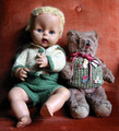
best loved onesby patryComment by kteach: This shot really needs the title for me to understand how it depicts 'love'. Seems a bit dark on the left, perhaps a bit of reflected light bounced back would have helped to lighten it up since this was basic editing. |
| 02/20/2007 10:24:10 AM |
lesson dayby patryComment by glad2badad: The first thing that jumps out at me on this photo is the carpet/rug. :D I'm being a little humorous, but seriously, first impressions are important. The other thing I notice right away is the cool color tone and glare from the light coming in from the window on the left. Use a reflector to bounce some light back in (white foam board works well) and adjust the color temp (white balance) a little towards a warmer tone. All JMO of course. :D Good luck in the challenge. |
 Photographer found comment helpful. Photographer found comment helpful. |
| 02/20/2007 03:35:06 AM |
|
| 02/18/2007 04:20:46 PM |
|
| 02/17/2007 04:55:45 AM |
lesson dayby patryComment by rennie: The composition and quality is nice, but the background looks accidental. |
| Photographer found comment helpful. |
| 02/14/2007 11:15:09 PM |
lesson dayby patryComment by Shrink: color cast on music page a little distracting. I would prefer whiter page and less a drift to bluer color toward the top. |
| Photographer found comment helpful. |
| 02/14/2007 05:04:58 PM |
lesson dayby patryComment by bassbone: The set up of this image could be helped greatly be cropping closer so that the distracting rug is not in view. You have some beautiful recorders to show off, I woudl have liked to see them closer. In addition, the lighting and white balance seem off (making the music seem bluish rather than white). 5 |
| Photographer found comment helpful. |
| 02/06/2007 05:49:53 PM |
naiadby patryComment by shutterpuppy: this just looks oof, not a deliberate use of dof. composition needs some work as well (perhaps fuller in the frame and at a steeper and/or opposing tilt?). sorry - 3. |
| 02/05/2007 07:21:17 AM |
|
Home -
Challenges -
Community -
League -
Photos -
Cameras -
Lenses -
Learn -
Help -
Terms of Use -
Privacy -
Top ^
DPChallenge, and website content and design, Copyright © 2001-2026 Challenging Technologies, LLC.
All digital photo copyrights belong to the photographers and may not be used without permission.
Current Server Time: 07/16/2026 05:56:49 AM EDT.